
R12 BOTANICALR12 Botanical grew from a kitchen counter to local market stalls.
With a brand built to survive a forced rebrand and keep growing.

01 · OVERVIEW
Reece Collins started R12 in his kitchen, blending natural balms to manage the eczema he'd lived with since he was twelve. By the time he came to me in 2024, he had one product, a powerful personal story, and no brand system to carry it forward. He needed an identity that could take the business from kitchen counter to local market stalls and beyond, while looking considered from day one.
Across the project, I delivered the brand identity, Shopify website, packaging system, social toolkit and printed pop-up materials, creating a cohesive presence from product label to online checkout.
Since launch, R12 Botanical has fulfilled thousands of orders, built a returning customer base, grown across both ecommerce and in-person pop-ups, and appeared in GB News, Surrey Live and the National Law Review. When a trademark issue forced a rebrand from R12 Botanics to R12 Botanical in early 2025, the system held its ground.
02 · THE BRIEF
Reece had spent years relying on prescription steroid creams that didn't work. The skincare aisle had let him down repeatedly. When he started making his own balm, blending mango butter, rosehip seed oil, raspberry seed oil and a natural ingredient list shorter than the pharmacy versions, he wasn't building a brand. He was solving his own problem.
The audience he eventually attracted were people just like him: tired of products that didn't deliver, sceptical of natural skincare brands that felt preachy, and wary of anything looking like another wellness product trying to sell a feeling.
The brand had to feel like the friend who'd actually been there, not the pharmacy and not the influencer.
THE IDEA

That single line shaped everything that followed. I designed the brand to be warm without feeling precious, natural without being sterile, and confident without turning clinical. Skincare made by someone who'd tried everything else first.
03 · THE WORK
The brand needed to do three things at once: hold its own on a shelf, work hard on a phone screen, and feel personal enough that customers believed in the founder behind it. I led with the strategy, then applied it across every touchpoint.
Scope: brand identity, packaging, Shopify website, social templates, print collateral, pop-up materials and rebrand rollout.
Logo
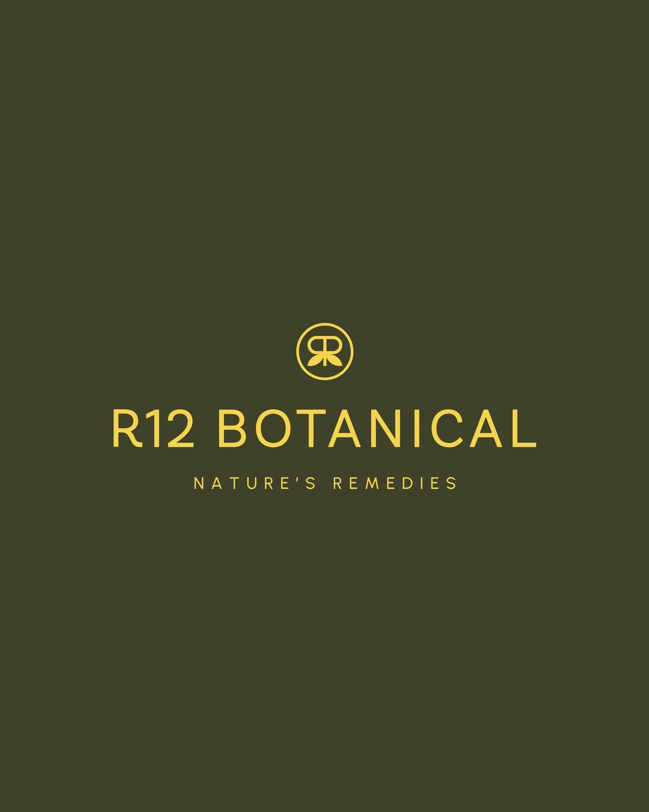
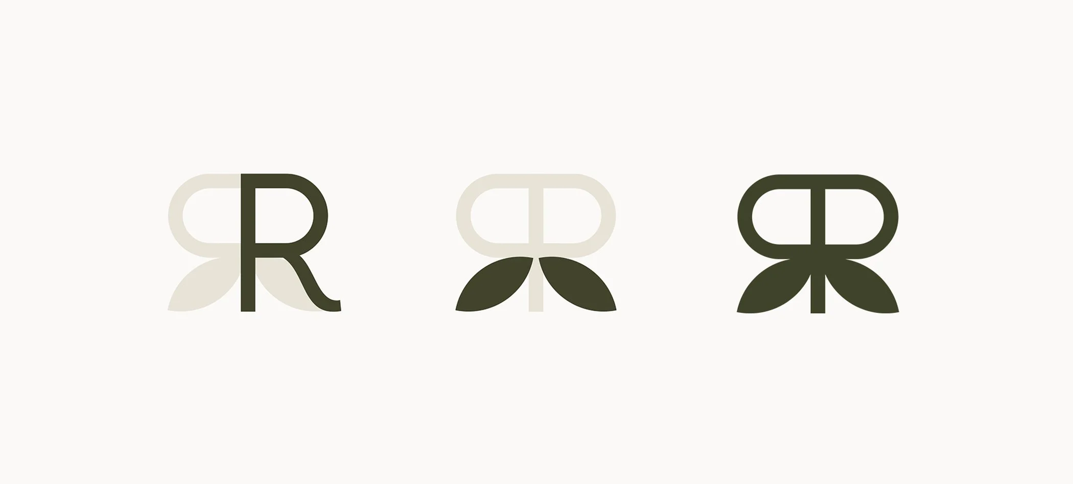
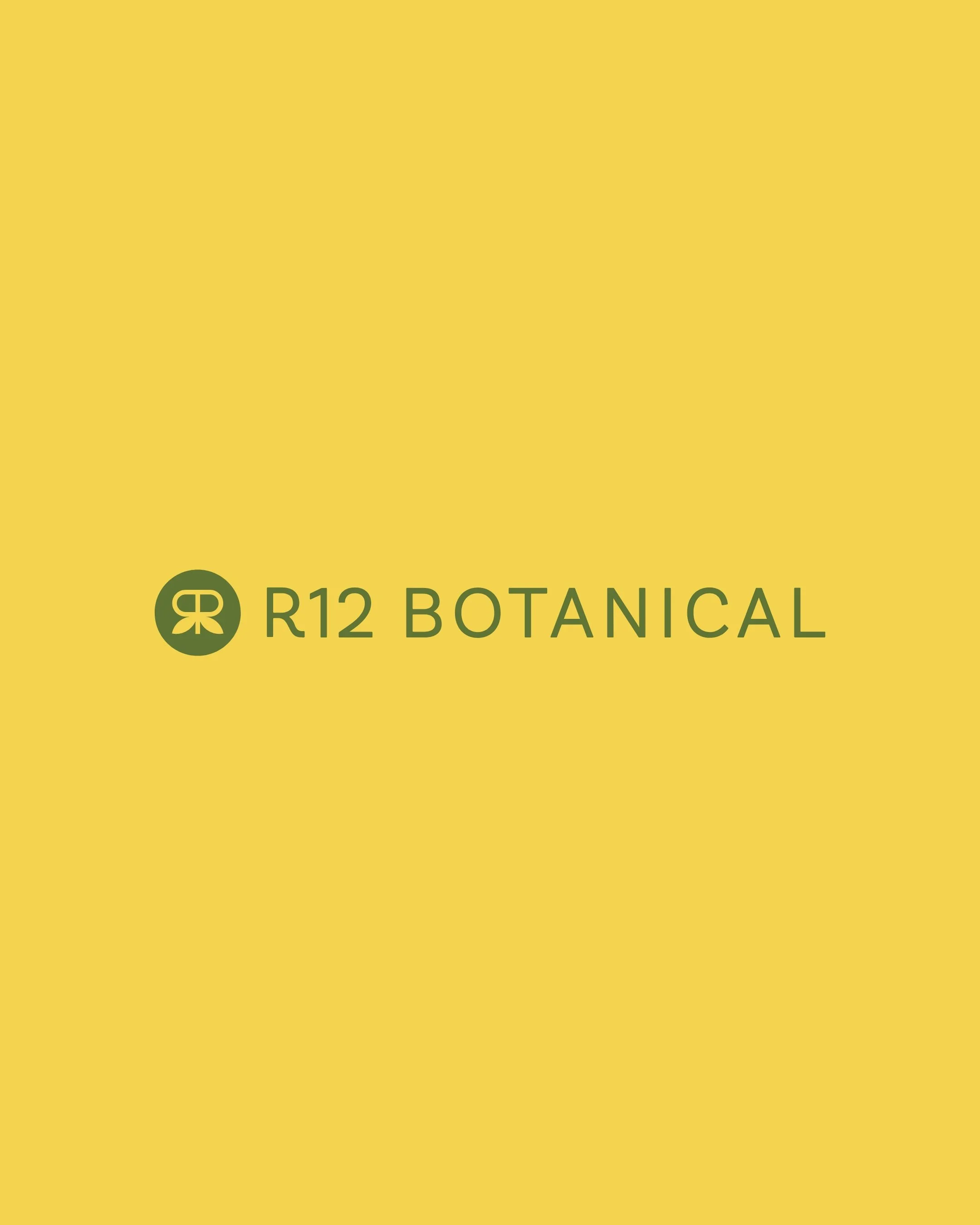
I anchored a clean sans-serif wordmark with a distinctive logo mark, an R formed from two leaves, referencing both Reece's initial and the natural ingredients at the core of the product. The mark works at any scale, from a 15ml jar lid to a market stall banner. Crucially, this mark is what made the later rebrand possible without losing recognition.
Colour and pattern
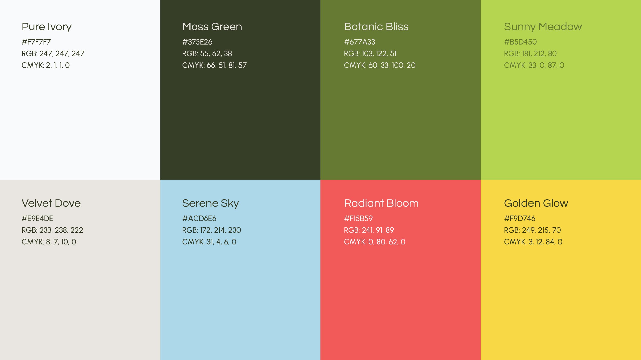
I built the palette around a calm natural base of Moss Green, Pure Ivory and Velvet Dove, giving the brand a soft but grounded foundation. From there, the brighter accents — Botanic Bliss, Sunny Meadow, Serene Sky, Radiant Bloom and Golden Glow — give each product line its own direction as the range grows.
The pattern was pulled directly from the leaf mark, creating a recognisable layer of texture that could carry the brand across packaging, print and digital moments when the wordmark doesn’t need to lead.


Packaging
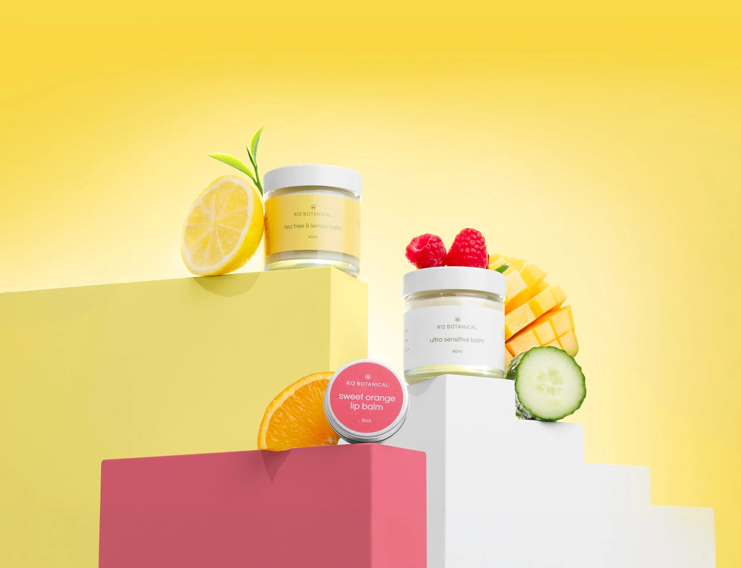
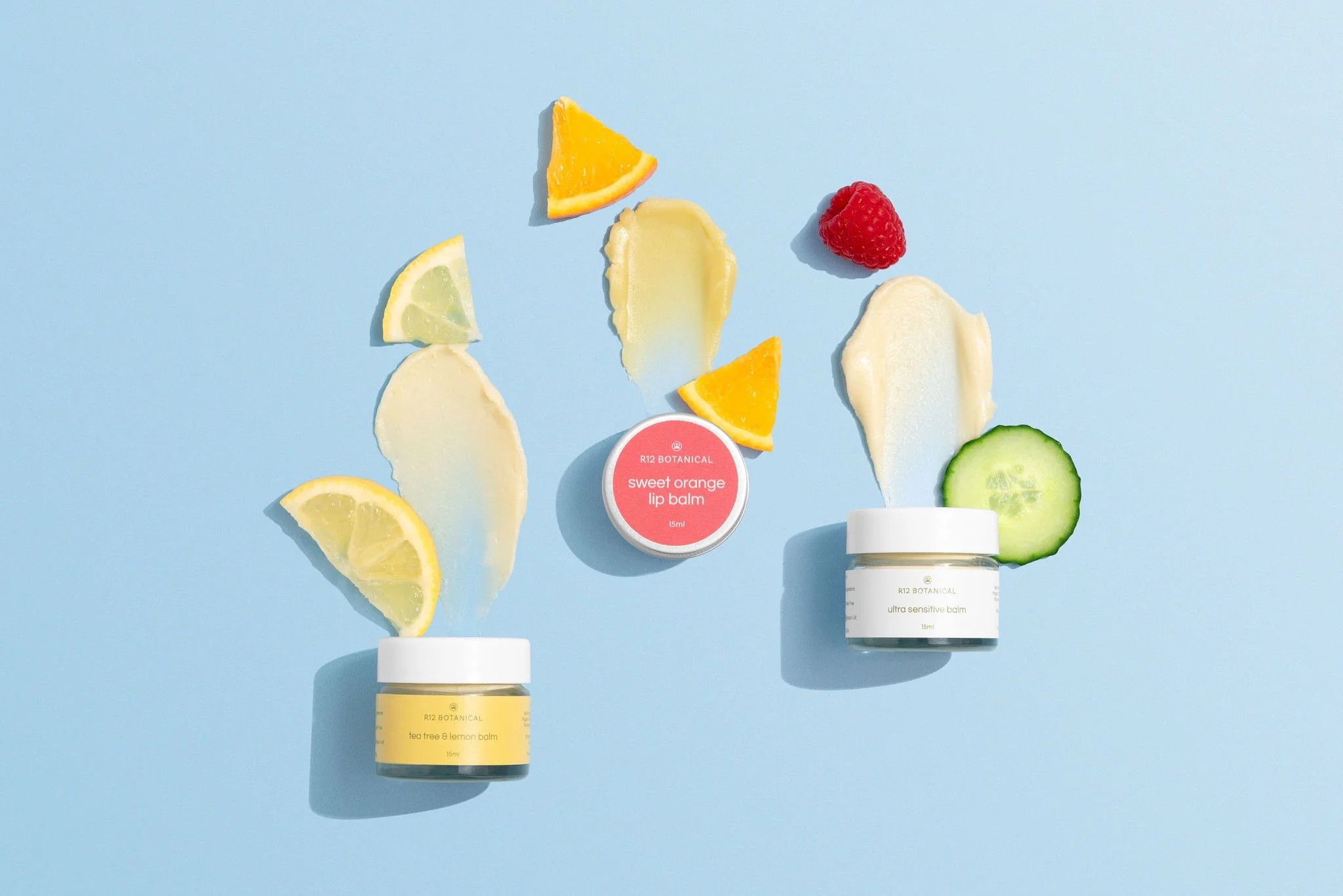
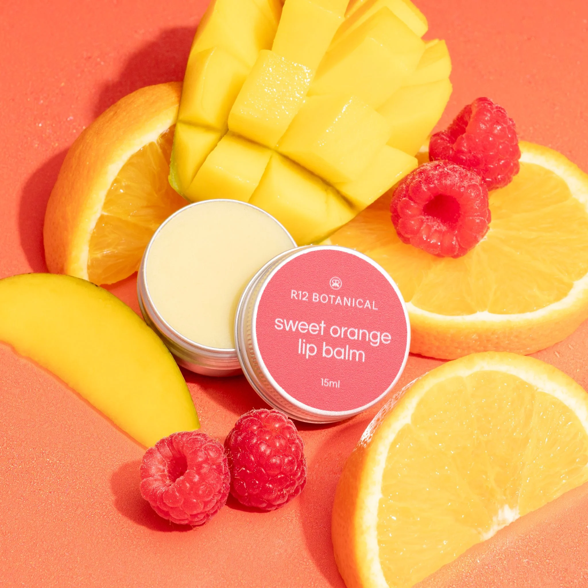
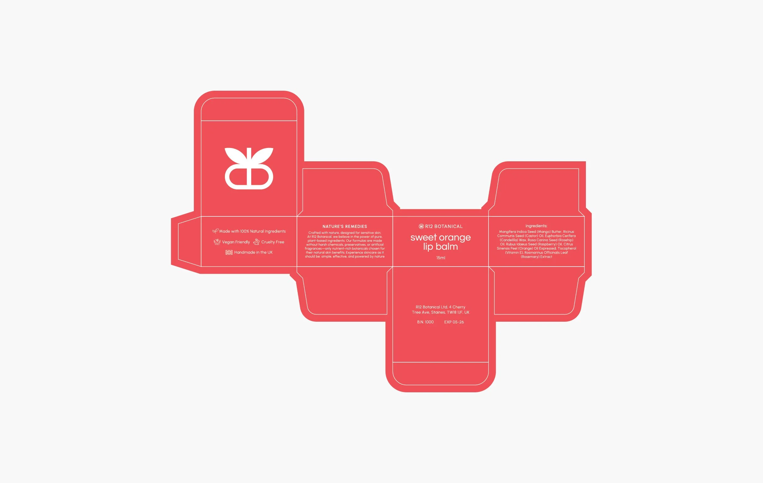
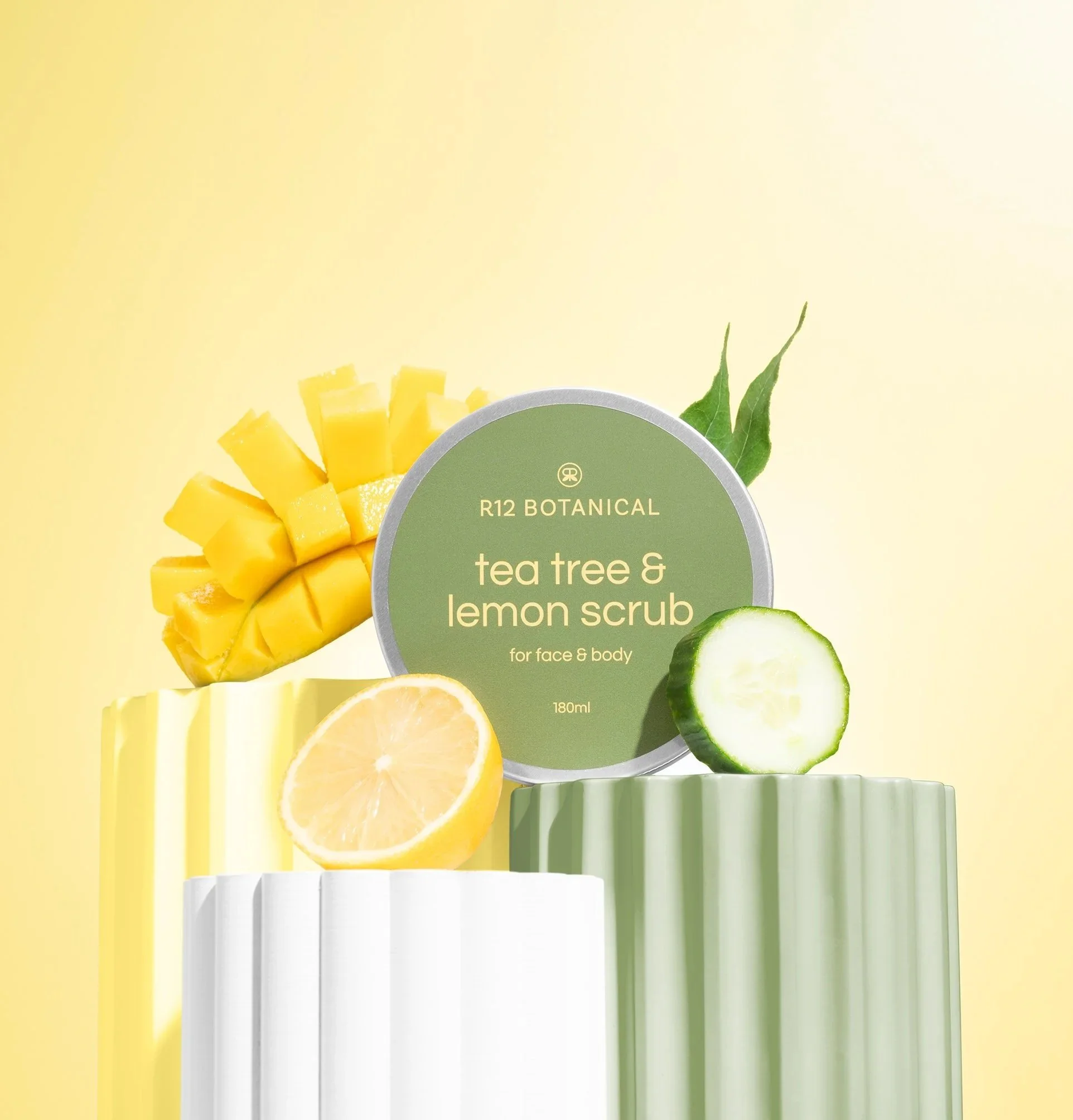
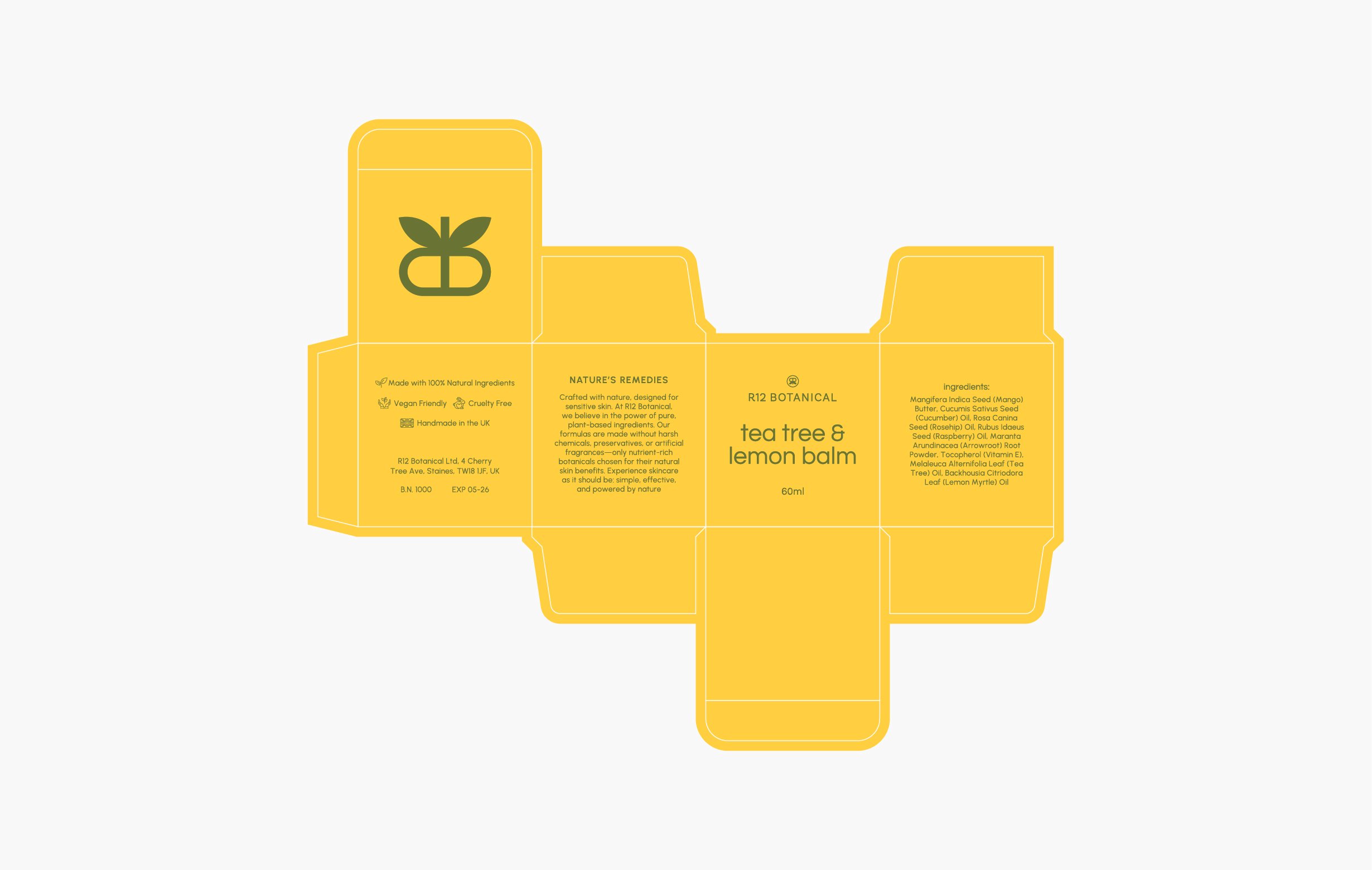
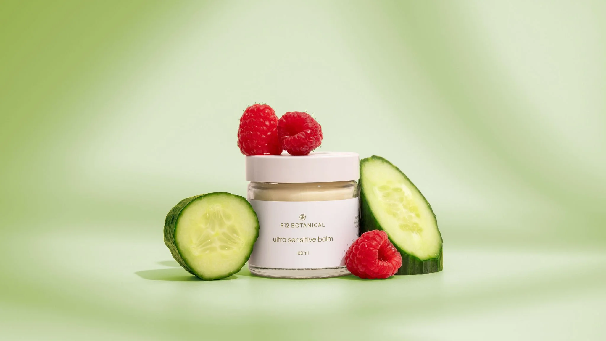
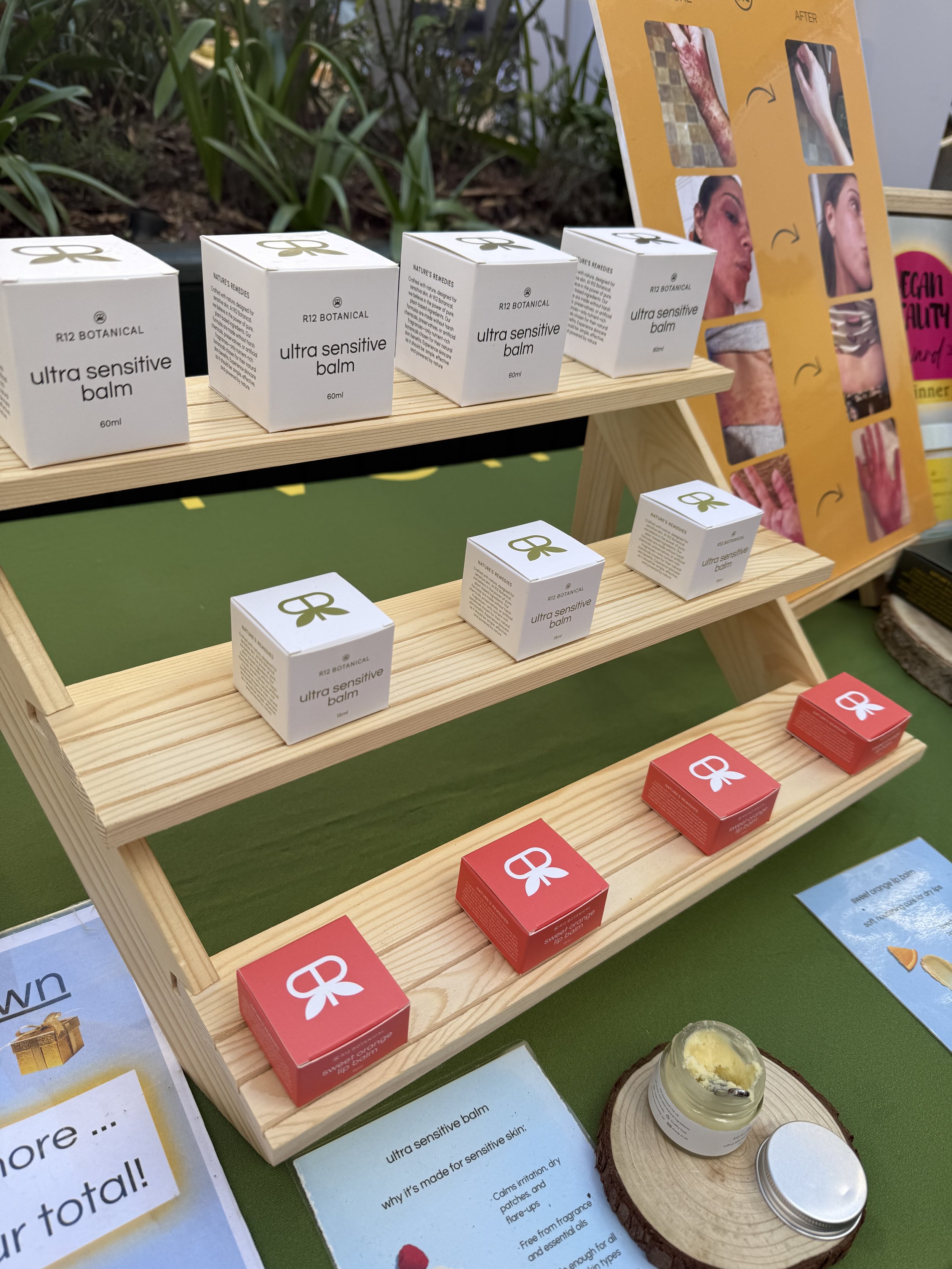
I built the packaging system to scale across the product range, from balm jars and lip products to future oils, scrubs and seasonal launches. Each label and box layout follows the same structure, giving R12 Botanical a consistent shelf presence while allowing the colour palette to flex by product type.
The system keeps product names, ingredients and usage details clear and easy to navigate, so new ranges can be added without rebuilding the packaging from scratch.
Social system
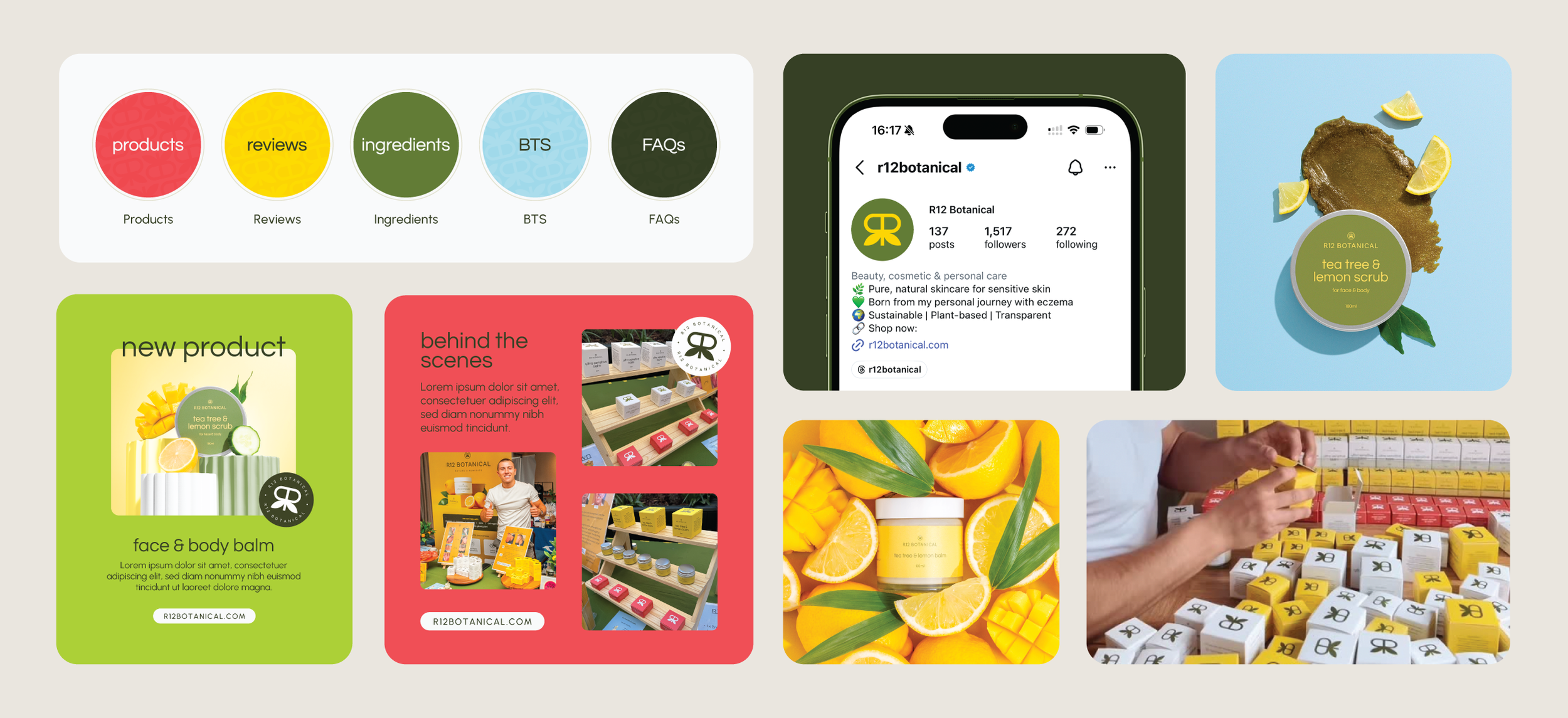
I designed custom Canva templates to take the brand straight onto Instagram without breaking pace. The kit includes highlight covers, post layouts and story templates, spanning six post styles: new product, customer review, behind the scenes, ingredient spotlight, sale and image-led reviews. I built this so Reece could post consistently without needing a designer for every update.
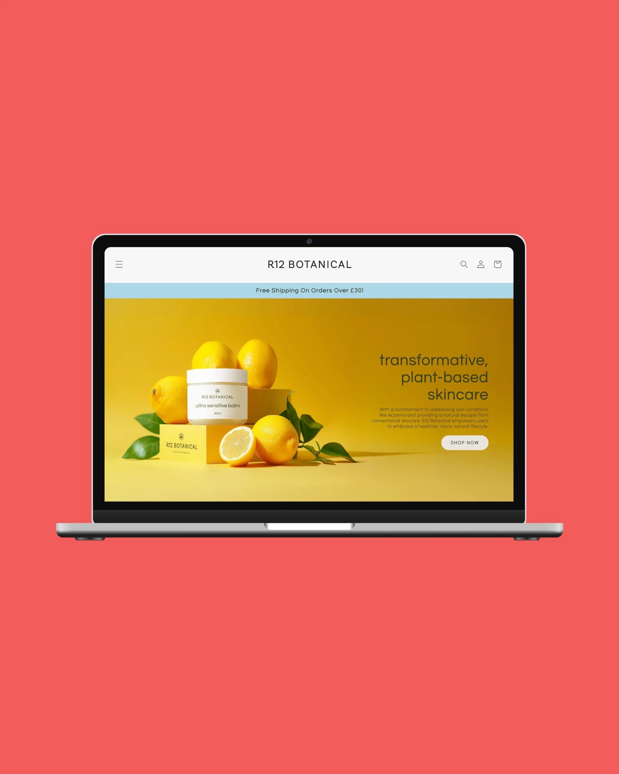
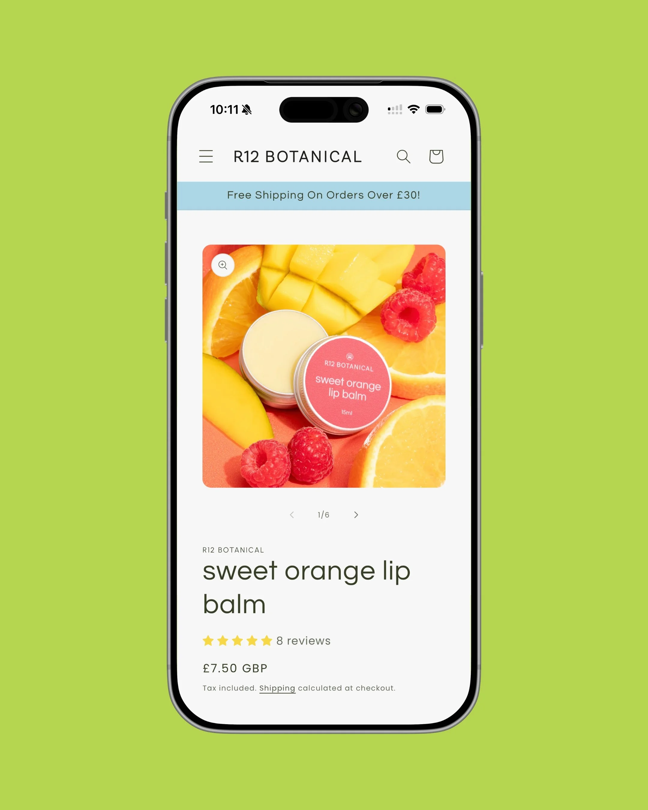
I built the Shopify site to cover the product pages, the founder story and the checkout. I designed it specifically for the audience Reece wanted to reach: clear, easy to navigate and focused on helping customers understand the products without feeling overwhelmed. The result is a practical ecommerce home that supports product discovery, storytelling and conversion in one place.
Website
In real life
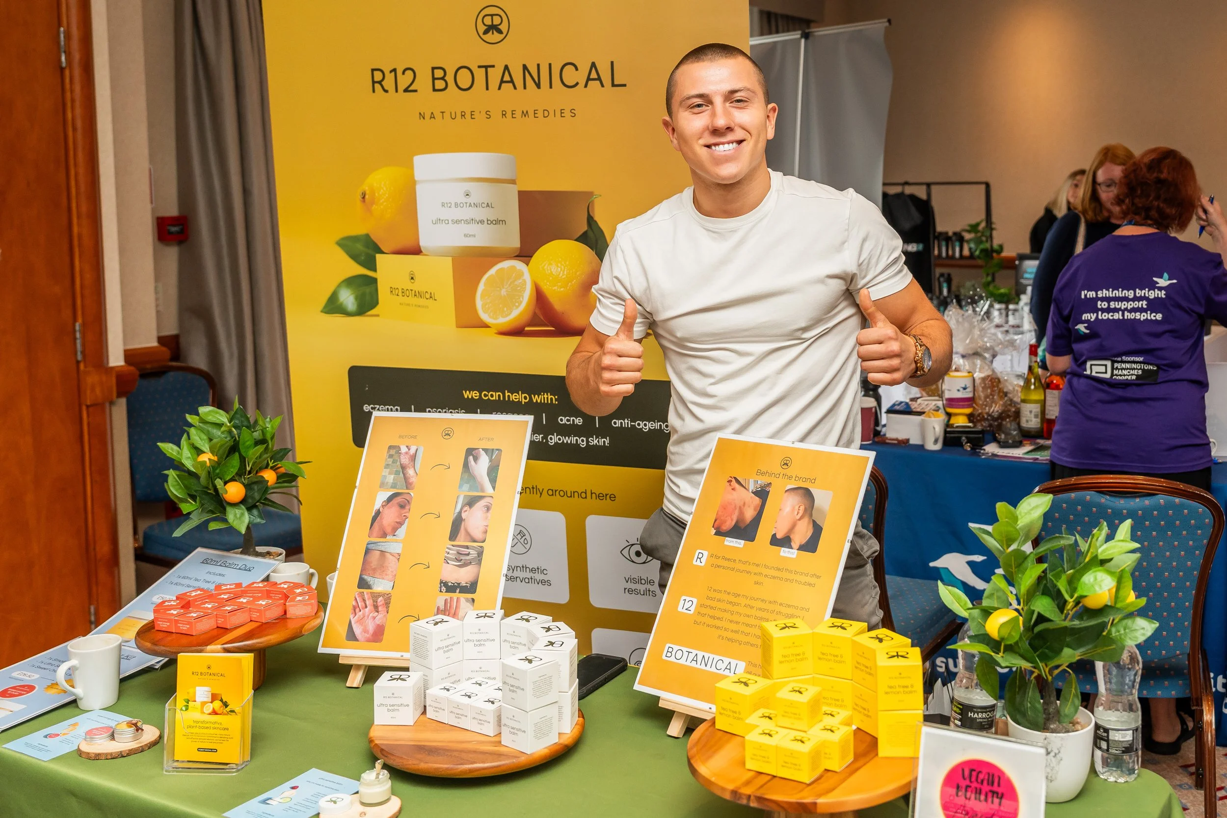
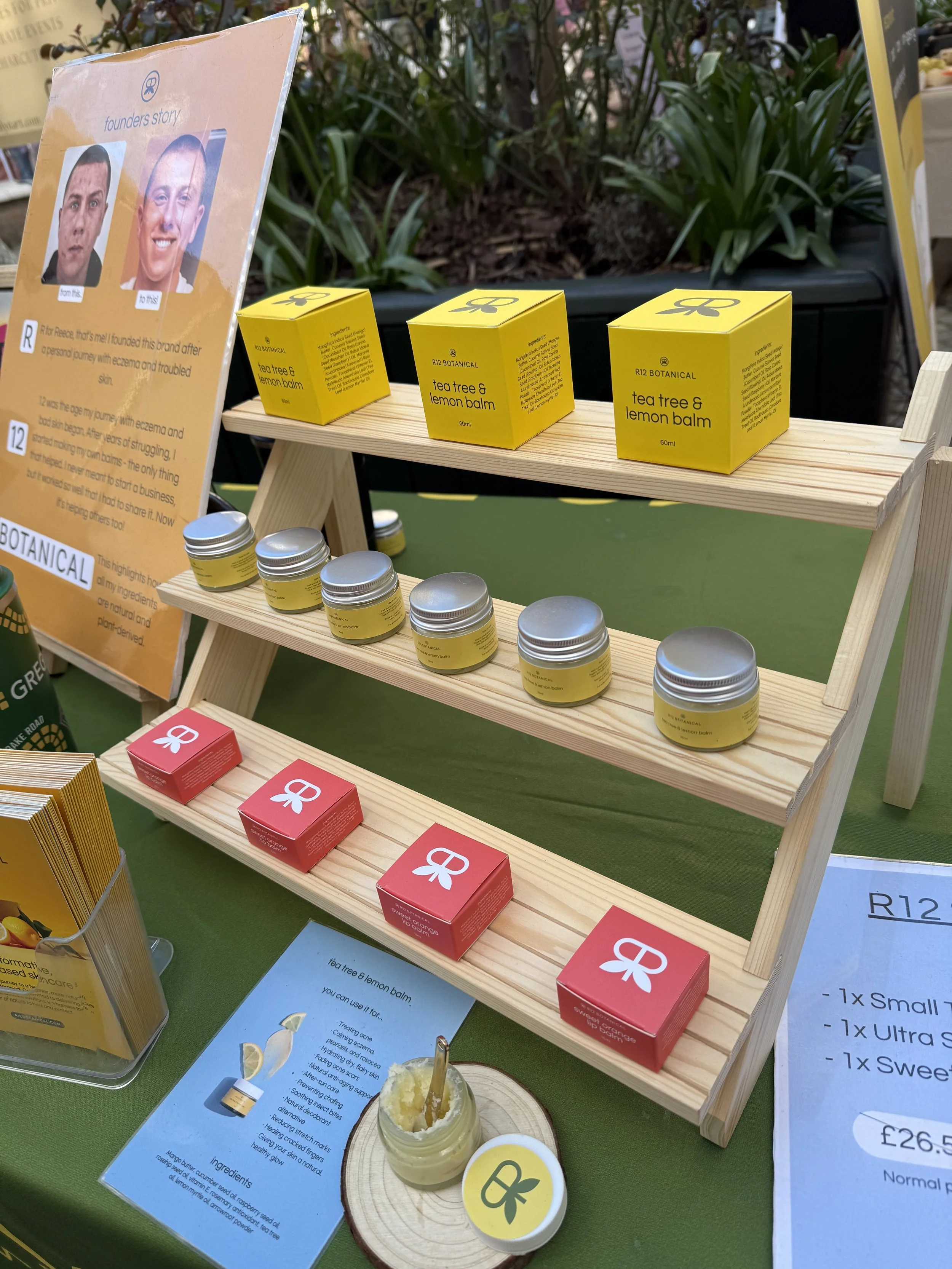
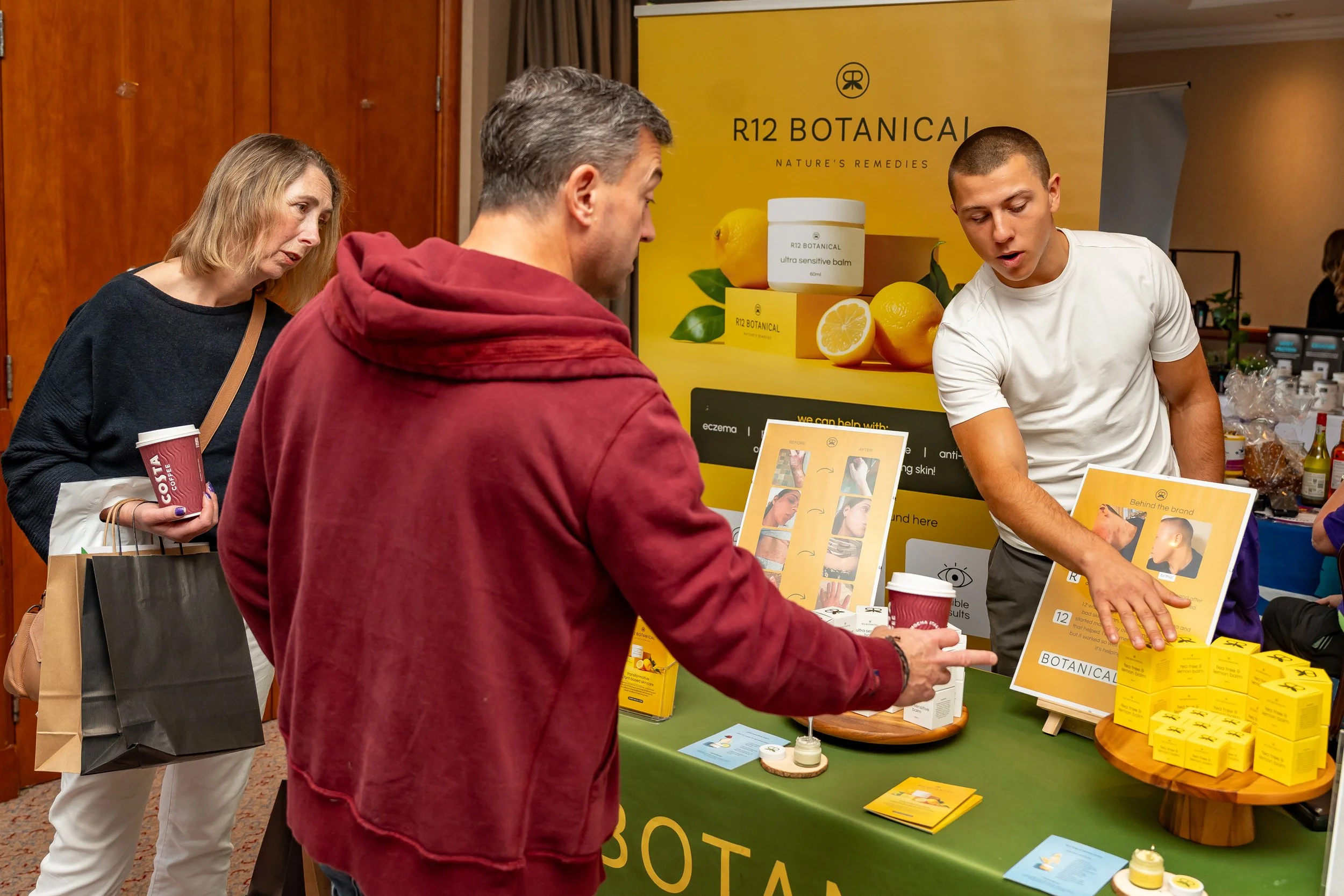
The print system carries the brand off-screen and onto the market stall. I designed the leaflets, banner, tablecloth and POS to make pop-up trading feel like a strategic extension of the brand rather than a side project.
Built to Adapt
04 · THE PIVOT
In early 2025, a trademark issue forced an unexpected pivot. R12 Botanics had to become R12 Botanical.
This is where the strategy-first approach earned its keep. Because the brand wasn’t built around a single wordmark, but around a cohesive system, the launch of the new name happened fast. The submark stayed. The palette stayed. The pattern stayed. The typography stayed. I updated the wordmark across the labels, boxes, website and social channels, while keeping the rest of the identity intact. Customers could still recognise the brand on day one of the new name. A brand built on more than its logo can take a punch. This one did.
Reece shared the name change with his audience, explaining the move from R12 Botanics to R12 Botanical and keeping customers informed through the transition.
05 · WHERE IT LANDED
R12 Botanical now has a brand system that works across product packaging, ecommerce, social content and in-person retail. The Shopify store is live, the product range continues to grow, and the print system gives the brand a consistent presence at pop-up stalls across the UK.
Since launch, the brand has fulfilled thousands of orders, built a returning customer base and continued to grow across both online and offline sales channels.
The identity also held its ground through a forced name change, proving the value of building a brand as a complete system rather than a single logo.
R12 Botanical has been featured in GB News, Surrey Live and the National Law Review, while Reece continues to build the brand through an active presence on Instagram, TikTok and local pop-up events.
What started as a kitchen experiment is now a brand that knows exactly where it’s going.
PROJECT IMPACTThousands
of orders fulfilled since launch
3 press features
including GB News, Surrey Live and the National Law Review
Multi-channel growth
across Shopify, social and in-person pop-ups
1 forced rebrand
absorbed without losing brand recognition
From Reece“Chloe was very attentive and helpful, always went above and beyond and I could tell she wanted nothing but the best possible outcome for my brand. She also did an impressive job at really understanding exactly what it is I wanted.”
Reece Collins, Founder, R12 Botanical
A NOTE FROM CHLOEFor trusting the process from a kitchen counter to a market stall, and for handling the rebrand with the kind of calm most founders would find hard to access in the moment.
Some routes keep going.
Chloe Overton,
Overton Design Studio
More work, more routes
Explore other brand identity, website and creative direction projects from Overton Design Studio.
READY FOR TAKEOFF?
Your brand has sat on the tarmac long enough. If you’re ready to turn your ideas into something that finally feels right, I’d love to hear about it.