
North Harbour Brand RefreshOne destination. Many moving parts. A clearer brand system to hold it all together.
01 · OVERVIEW
A growing community with more than one story to tell.
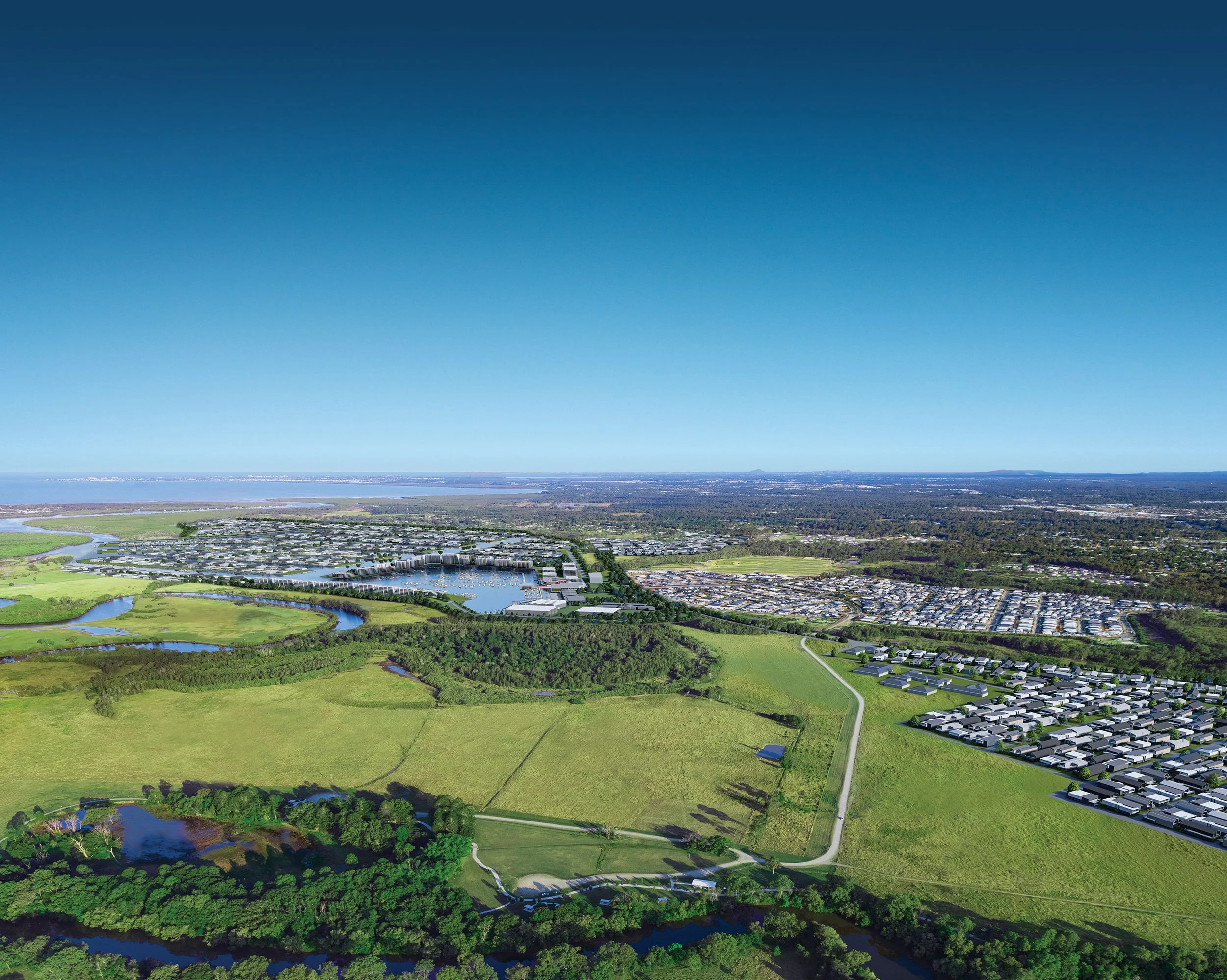
North Harbour is a masterplanned community in Burpengary East, bringing together residential neighbourhoods, open space, commercial precincts, industrial land, future retail and a proposed marina under one growing destination.
As the development expanded, the brand needed to speak to very different audiences: families looking for a place to call home, businesses seeking commercial opportunity, investors looking for long-term growth and future buyers drawn to a more premium lifestyle vision.
The challenge was to create more consistency across a complex property development brand without losing the recognition North Harbour had already built.


02 · THE BRIEF
Refine the identity without starting again.
North Harbour did not need a completely new brand. It needed a clearer system around the brand people already recognised.
The brief was to refine the main logo, retain the compass as a key identity asset and create a more considered sub-brand suite across North Harbour Marina, Central, Tavern, Homes, Business Park and Funds Management.
The system needed to feel more premium, more cohesive and easier to apply across digital, print and signage.
THE IDEA
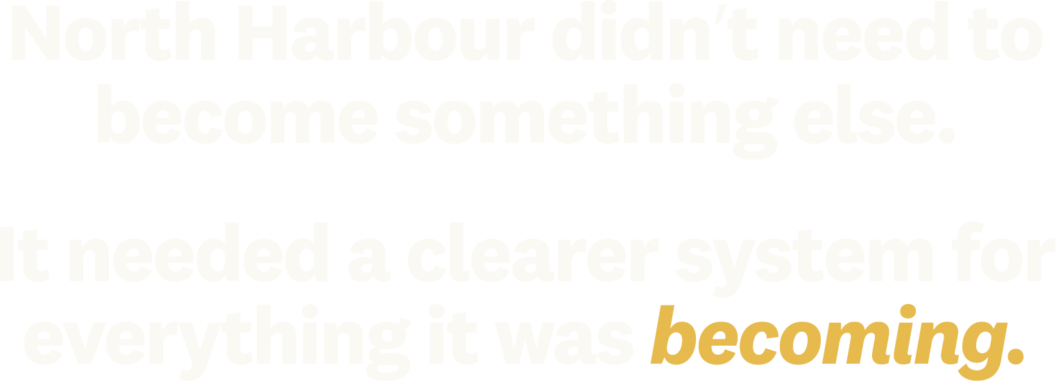
That idea shaped the direction of the refresh. The work needed to protect what North Harbour already had recognition for, while giving the identity more structure, consistency and room to support future growth.
03 · THE work
Building the system behind the brand.
The refresh focused on three things at once: refining the core identity, creating a more intentional sub-brand system and building practical design rules that could work across digital, print, signage and future brand applications.
Scope: brand refresh, logo refinement, sub-brand system, brandmarks, colour palette, typography, pattern, brand guidelines, print collateral, signage support and digital applications.
Logo RefinementRefining the main identity.
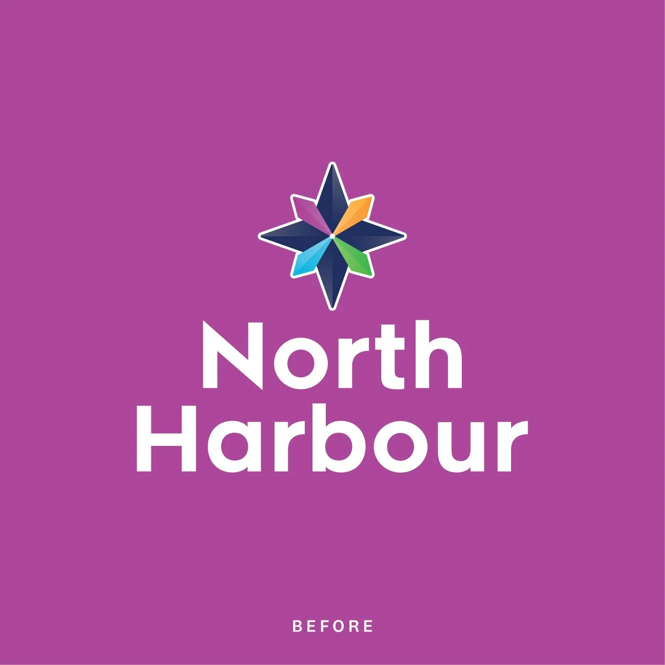
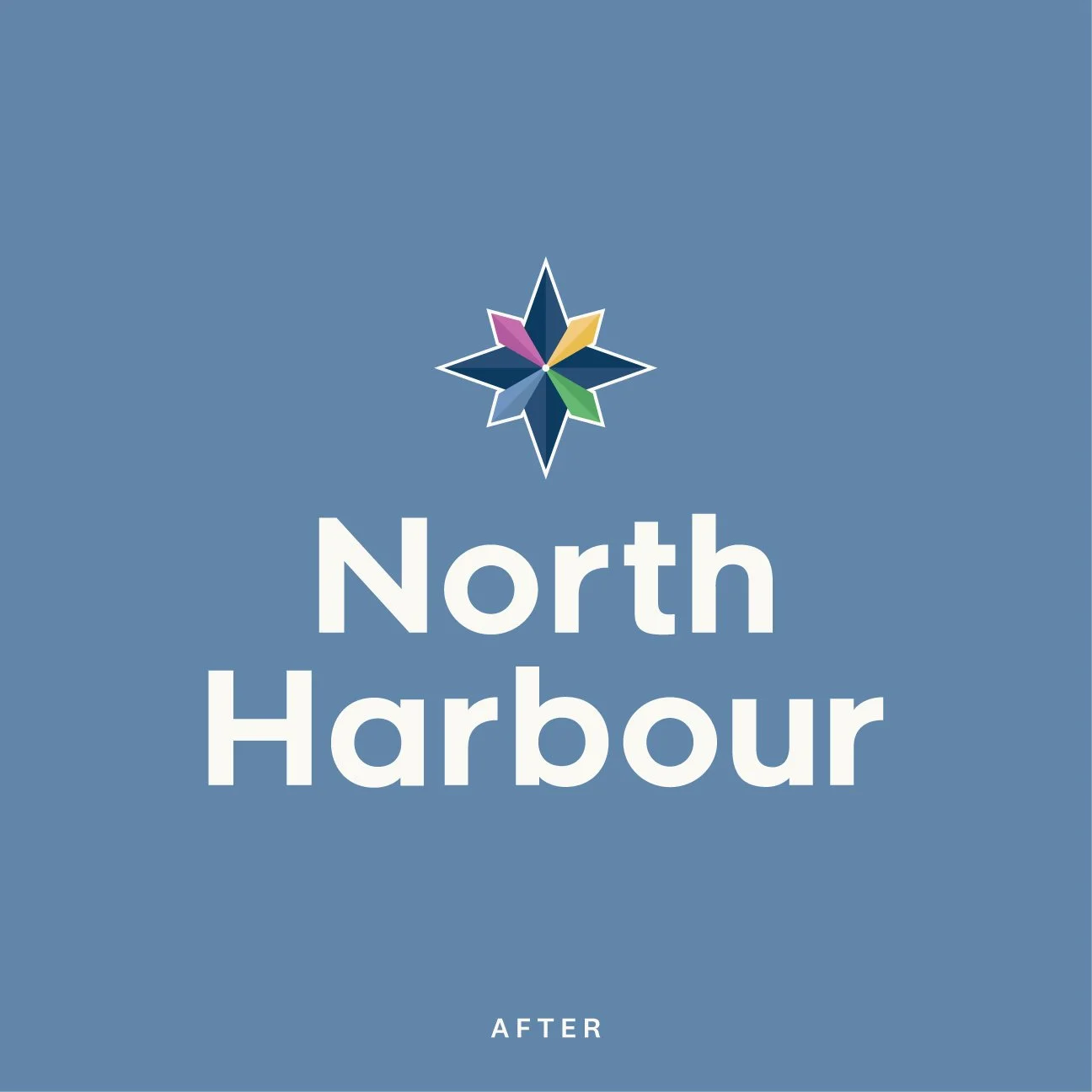
The existing North Harbour identity had strong recognition, so the refresh focused on refinement rather than replacement.
I worked to improve the balance, legibility and overall professionalism of the logo, while retaining the compass as a central part of the brand. The aim was to make the identity feel more polished and premium without losing the familiarity North Harbour had already built.
The compass remained an important visual anchor across the system, giving the brand a recognisable symbol that could continue to represent direction, connection and growth.
Sub-brand ArchitectureCreating a connected family of brands.
North Harbour needed a sub-brand system that could give each precinct and business area its own clarity, without pulling away from the main identity.
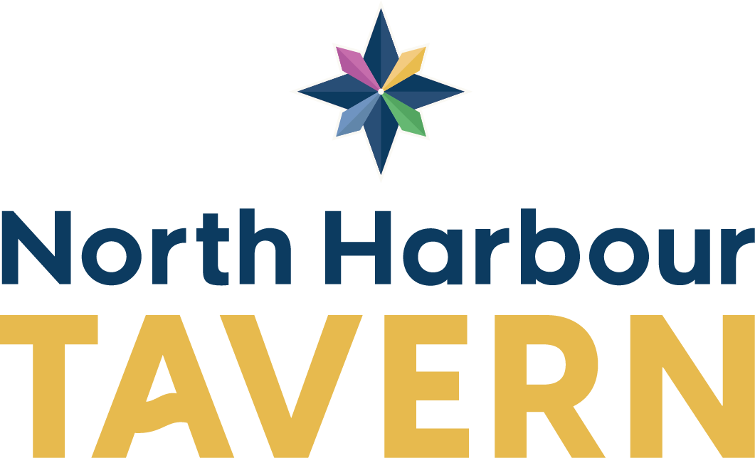
I created a consistent suite across North Harbour Marina, Central, Tavern, Homes, Business Park and Funds Management, using shared hierarchy, colour logic and logo structure to keep each variation recognisably part of the North Harbour family.
The goal was to move the sub-brands from simple add-on lockups to a more considered identity suite.



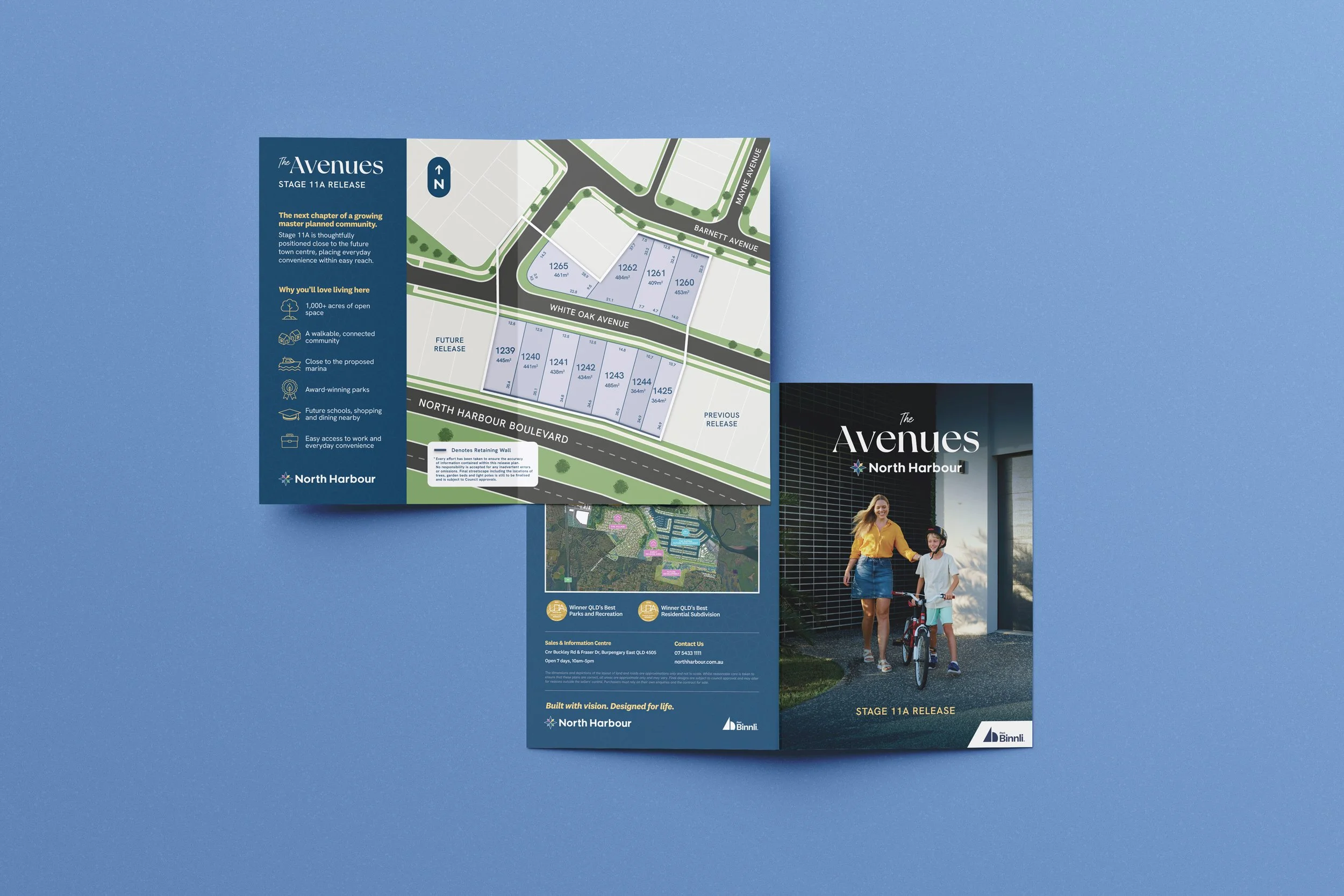
RELEASE IDENTITY
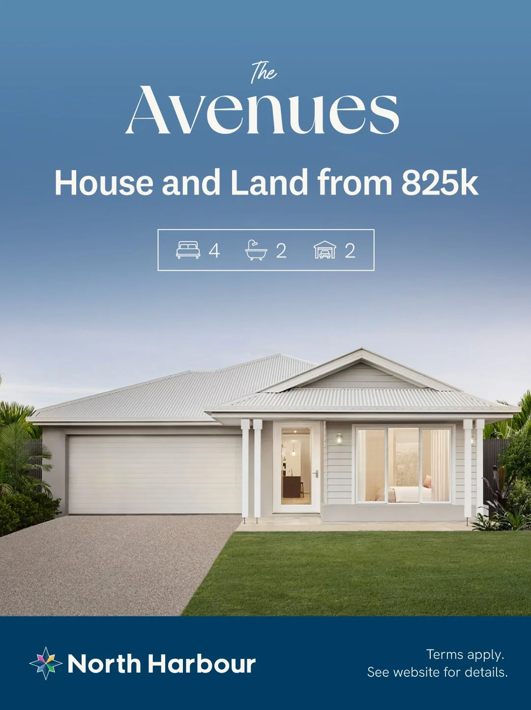
Giving The Avenues its own presence within the wider North Harbour system.
The release identity created a softer, more residential expression of the brand while keeping it clearly connected to the wider North Harbour family.

BrandmarksMaking the identity work in smaller spaces.
Alongside the main logo and sub-brand suite, I developed a set of brandmarks to support smaller, more flexible applications.
These included NH monograms, compass-led marks and compact lockups designed for social media, signage, merchandise and brand moments where the full logo would be too large.
The aim was to give North Harbour more flexibility without fragmenting the identity.



Colour, Type & PatternGiving the brand more range and consistency.
The refreshed colour palette kept the vibrancy of the compass, but introduced more control around how the colours were used.
Harbour Navy created a more premium and grounded base, while Seaside Blue, Bayleaf Green, Golden Sand and Sunset Orchid brought warmth, energy and flexibility into the wider system.
Typography and pattern added the final layer. A stronger heading typeface gave the brand more confidence, while the geometric pattern, inspired by the compass, created a distinctive visual tool for signage, stationery, digital backgrounds and printed collateral.

The Palettedrawn from land, water and community.
The compass colours were already part of North Harbour's recognition, so the refresh focused on refining the tones into a calmer, more flexible system.
The anchor — used for primary type, structure, and depth across the system.
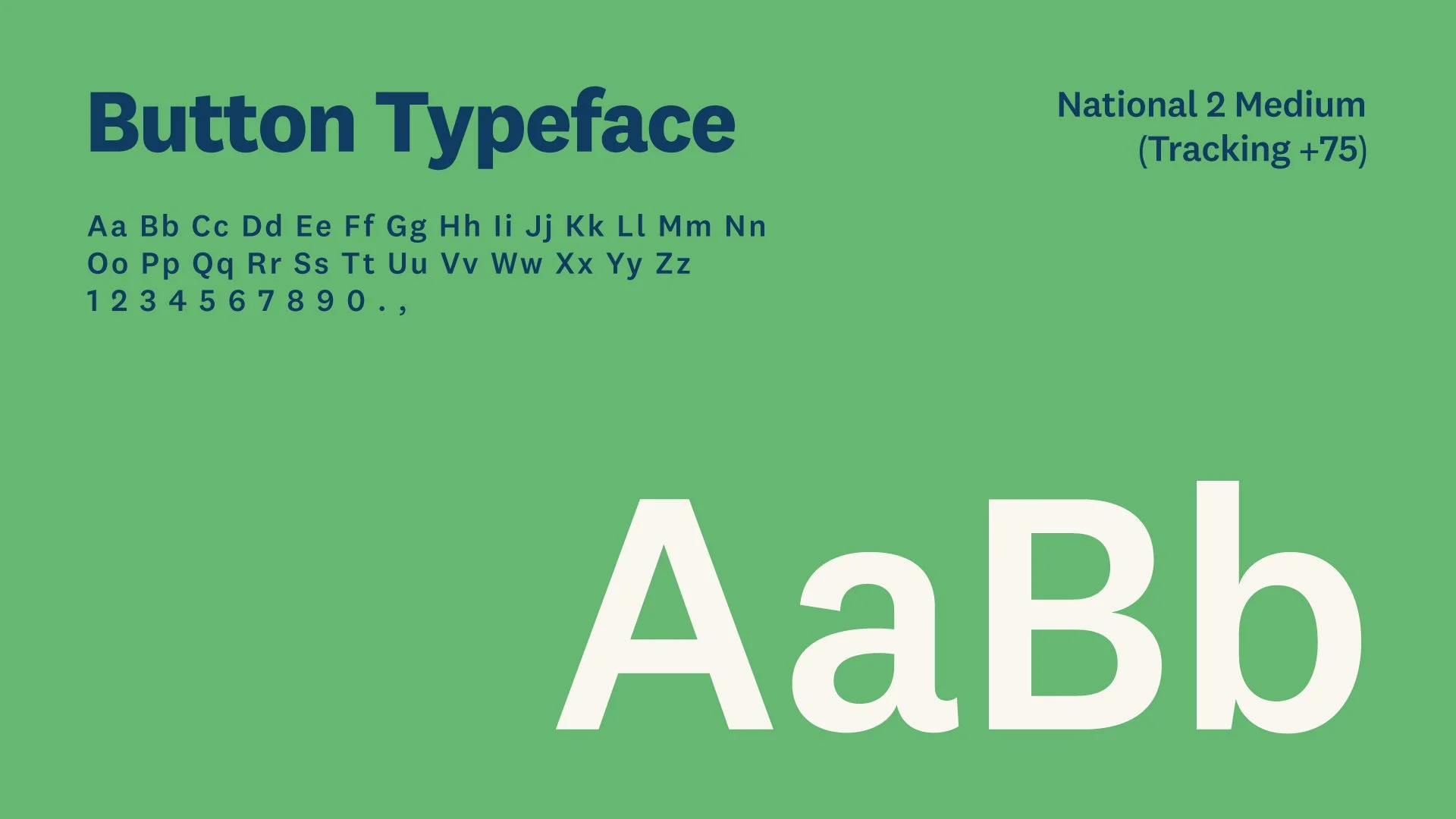
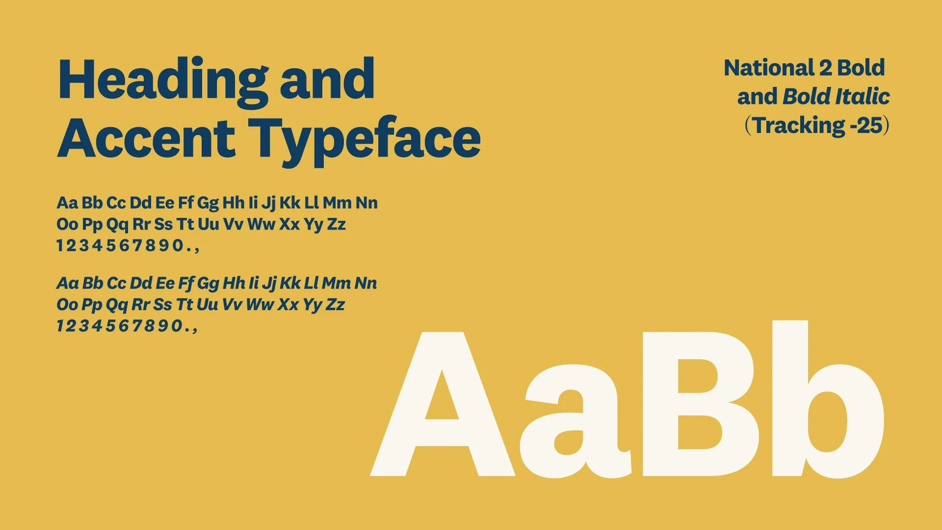
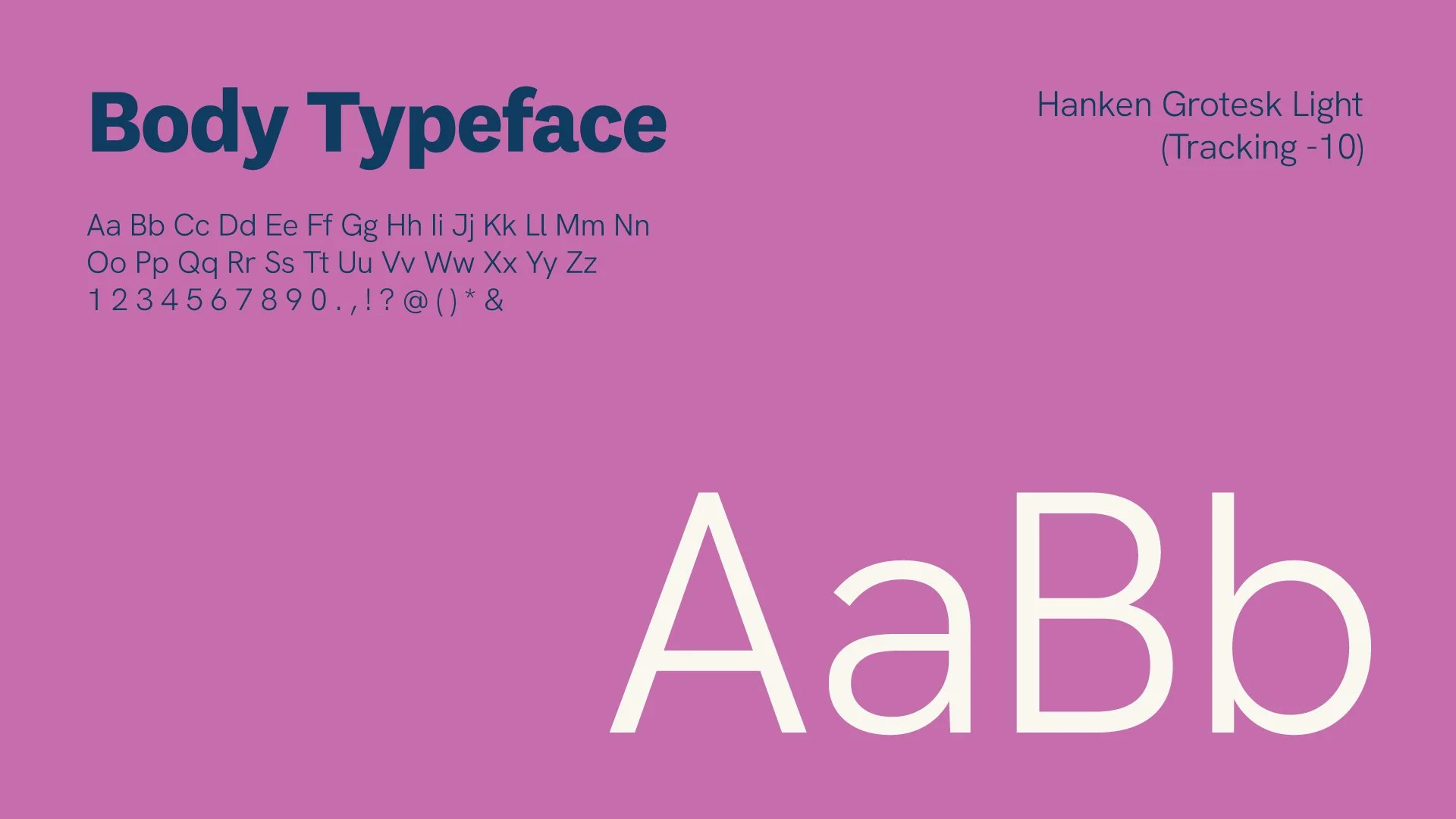
TypographyA type system designed to balance structure with warmth.
The refreshed typographic suite gave North Harbour a clearer hierarchy across sales documents, signage, social posts and campaign material.
A stronger heading style brought more confidence and recognition, while the supporting typefaces kept the system practical, legible and easy to apply across different formats.
The aim was to create a type system that felt structured, premium and approachable.
PATTERN SYSTEMCreating recognition beyond the logo.
The compass geometry became a flexible pattern system, adding structure, movement and recognition across printed collateral, digital backgrounds, signage and campaign assets.
It gave the brand a repeatable visual language that could support different messages without relying on the logo alone.


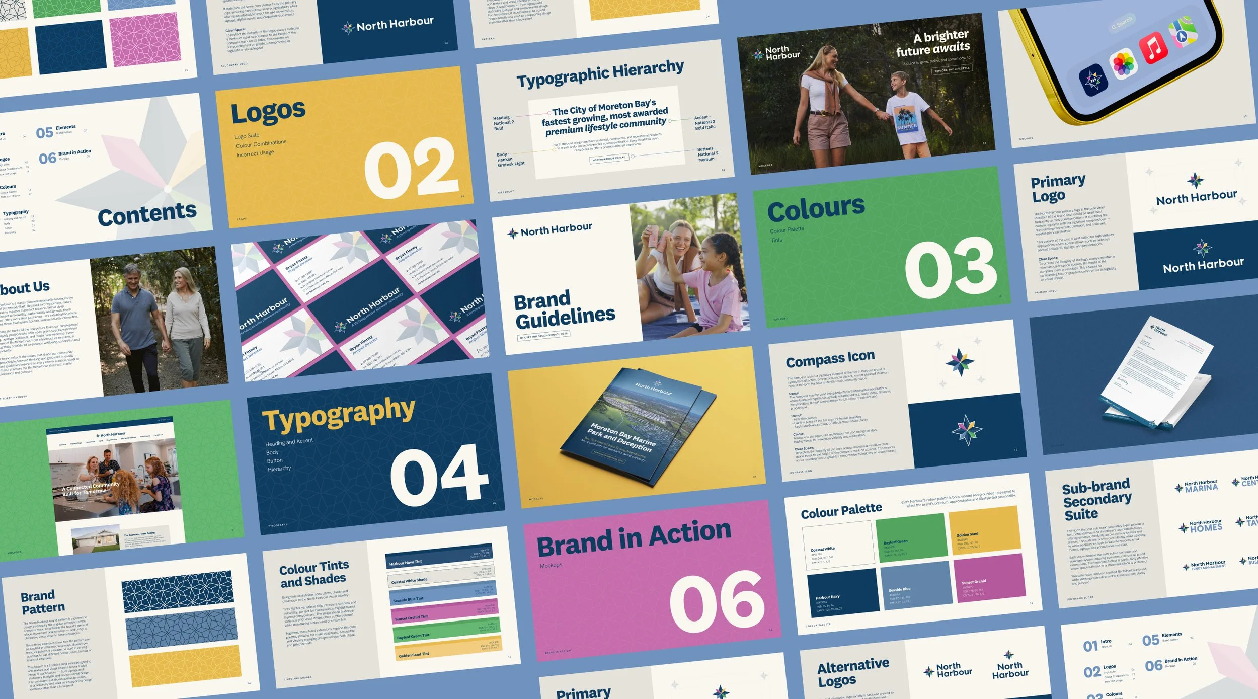
Brand GuidelinesCreating a practical framework for future use.
Because North Harbour works across so many touchpoints, the guidelines needed to be clear, practical and easy for different teams and partners to use.
I created a brand guidelines document covering logo usage, colour combinations, typography, pattern application, incorrect usage and brand mockups, giving the team a more consistent reference point for future design decisions.
The aim was to make the refreshed identity easier to apply, not harder to manage.
Brand in ActionDesigned to work beyond the brand deck.
The refreshed identity was designed to move beyond the logo suite and into the real-world touchpoints North Harbour needed every day.
Across sales materials, signage, maps, street directories, digital assets and printed collateral, the system had to stay clear, consistent and easy to apply.
The result was a practical brand framework that could support polished marketing moments, everyday communication and future place-based applications.
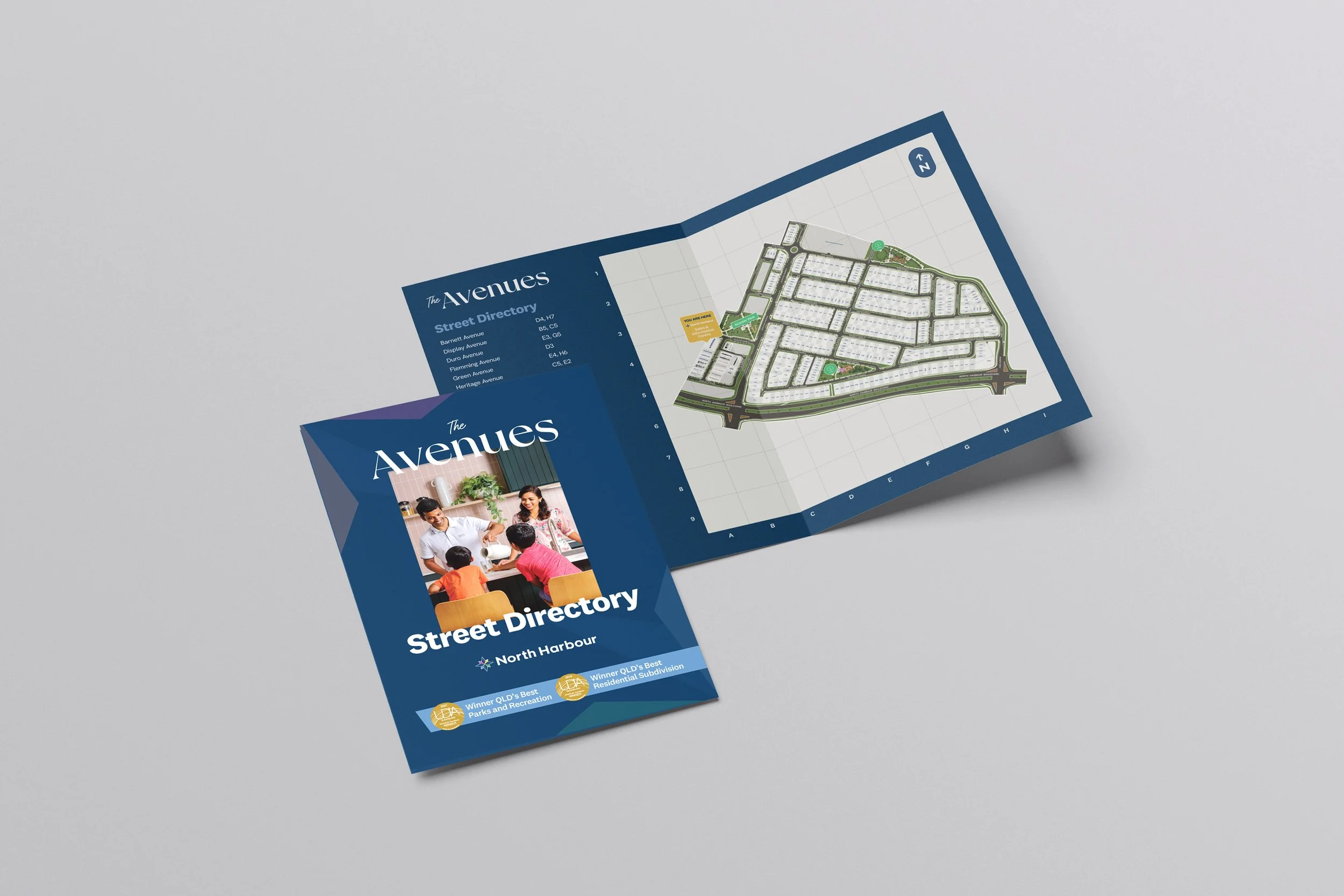
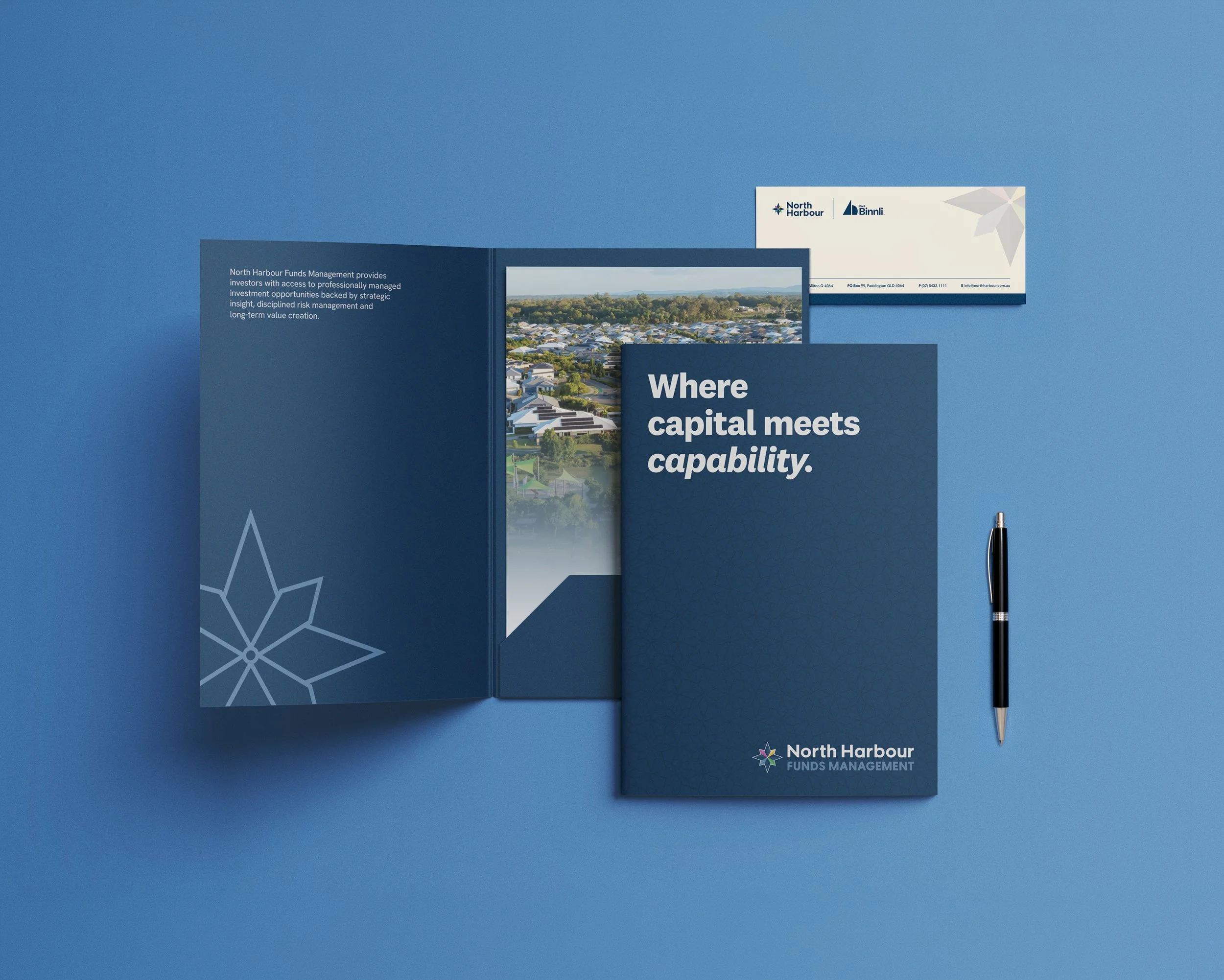
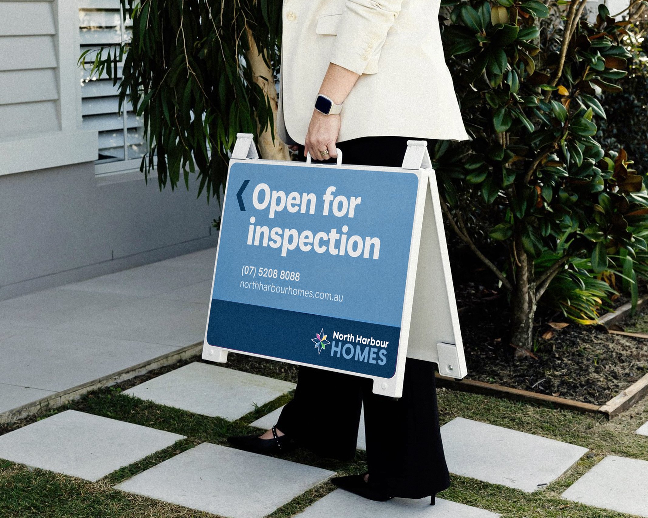
Print & SignageBringing consistency to everyday brand touchpoints.
North Harbour’s identity needed to work across the practical materials people see, use and rely on every day.
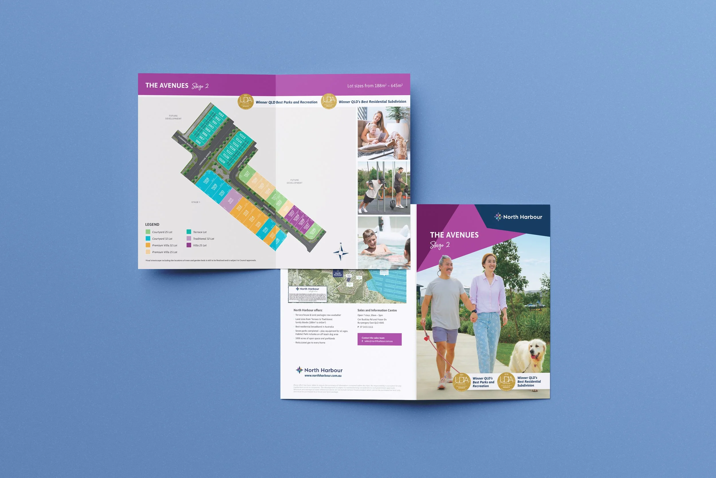
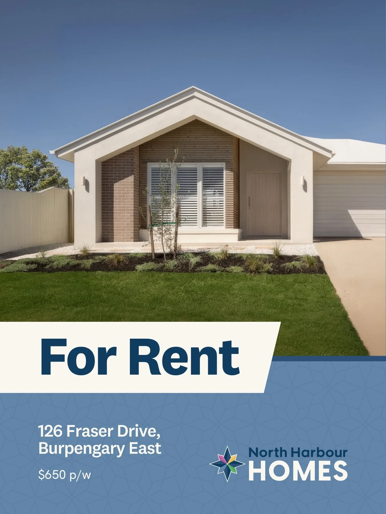
I applied the refreshed system across printed collateral, land release documents, stationery, signage, billboards and supporting sales materials, making sure each piece felt connected without becoming repetitive.
The aim was to create a more consistent brand experience across both polished marketing moments and functional, information-led communications.
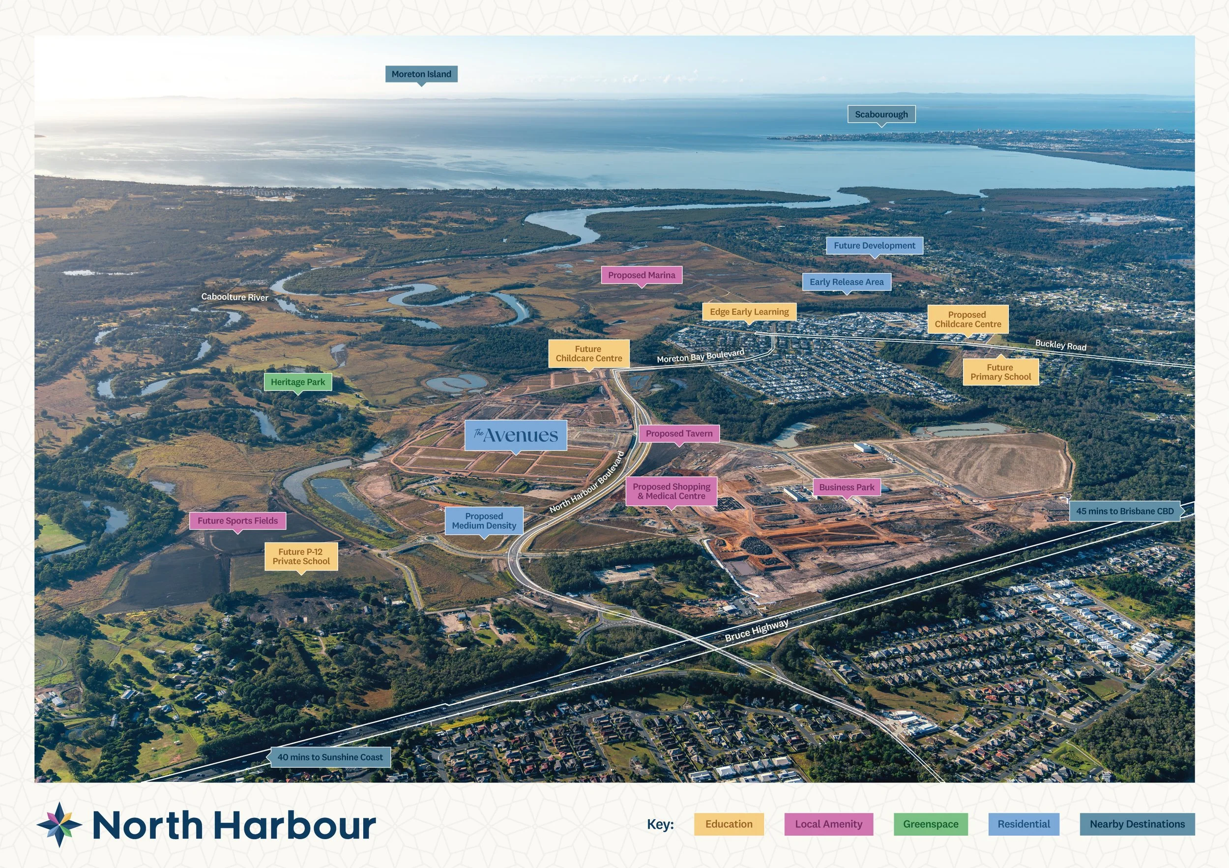
Maps & MasterplansMaking a large-scale community easier to understand.
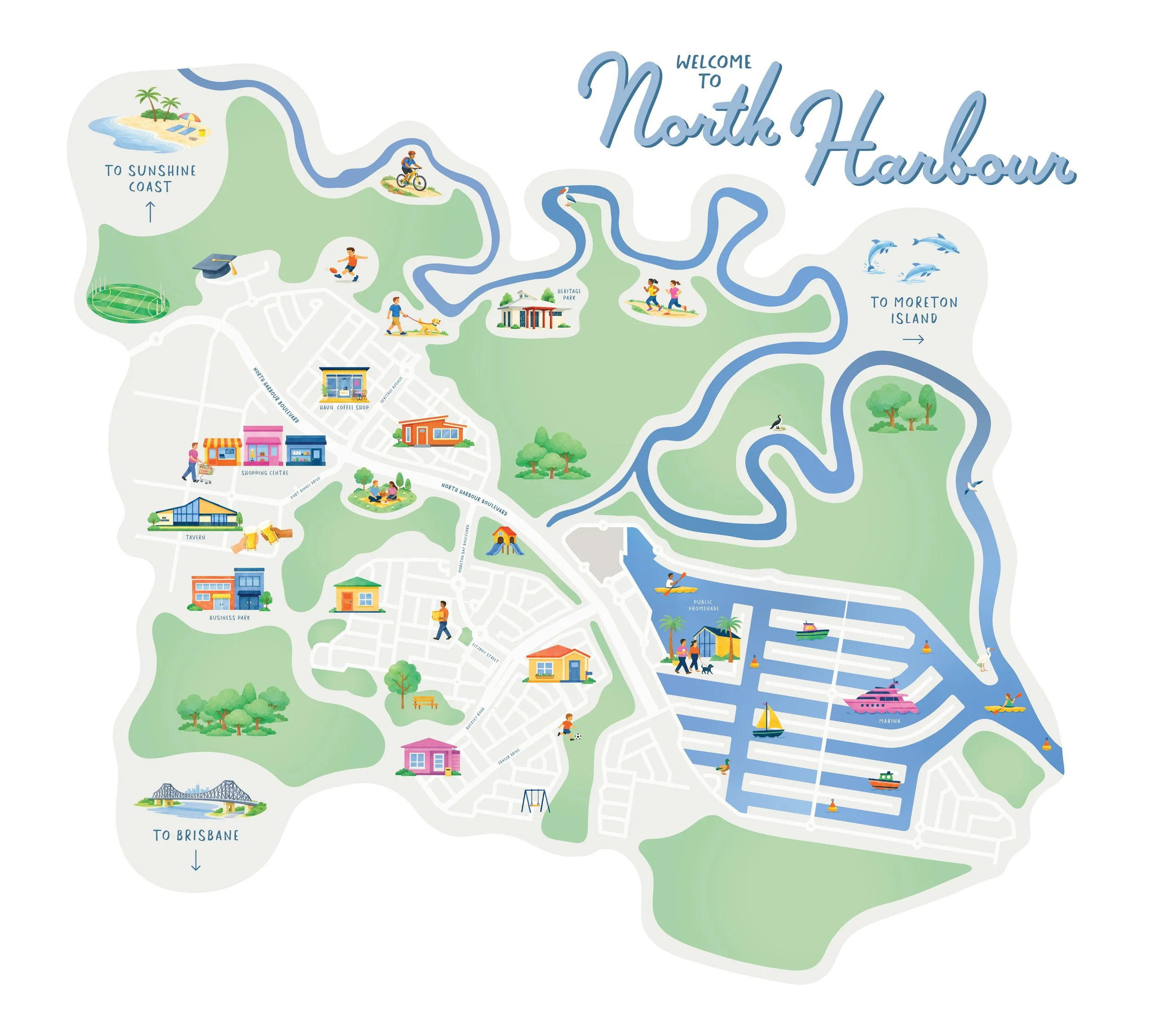
For a masterplanned community, maps are more than supporting graphics. They help people understand the scale of the development, the relationship between precincts and the future vision of the place.
I worked across masterplans, street directories, aerial maps and supporting visual assets to help North Harbour communicate complex information in a clearer, more considered way.
The refreshed system gave these functional pieces a stronger visual link back to the wider brand, making them feel less like separate planning documents and more like part of one connected identity.
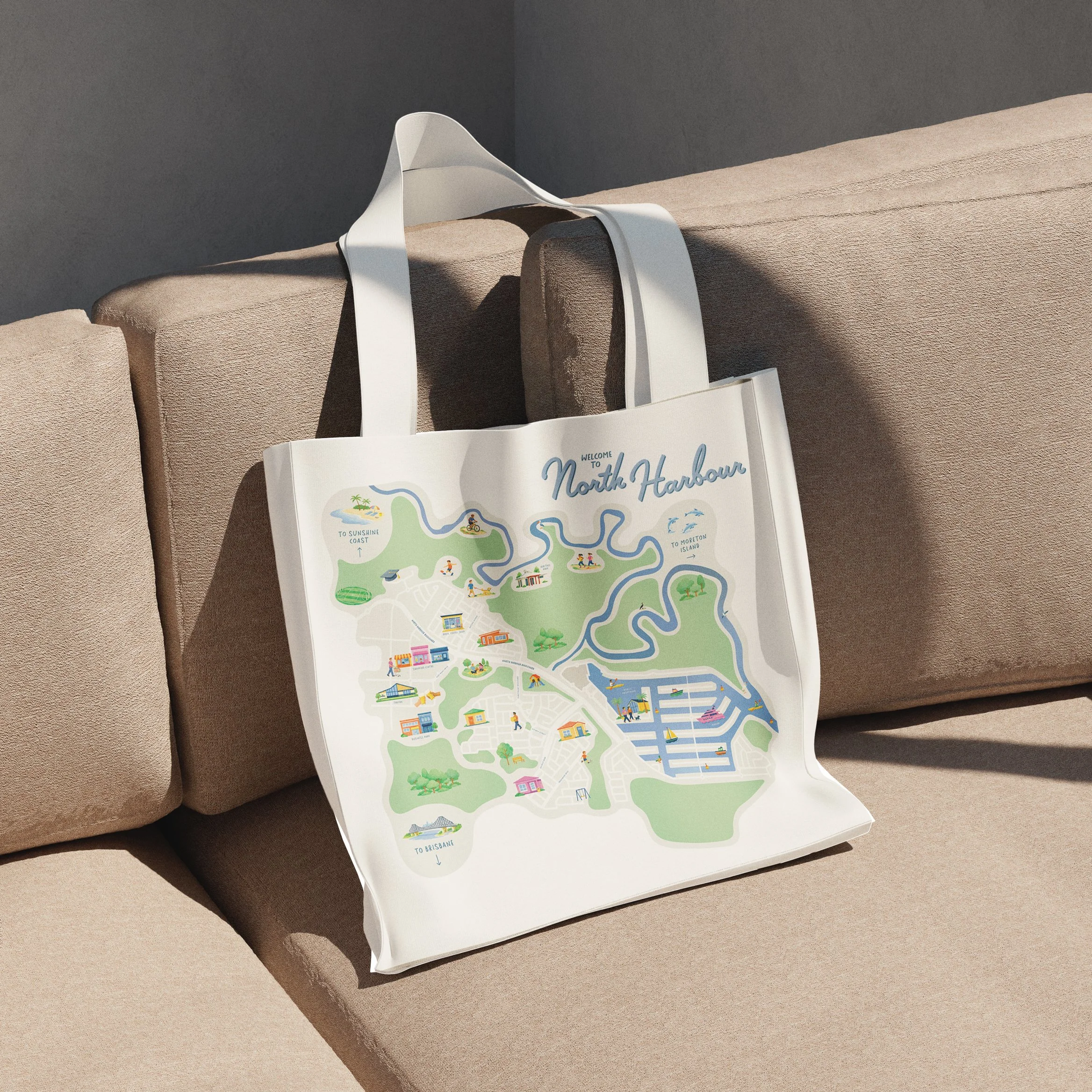
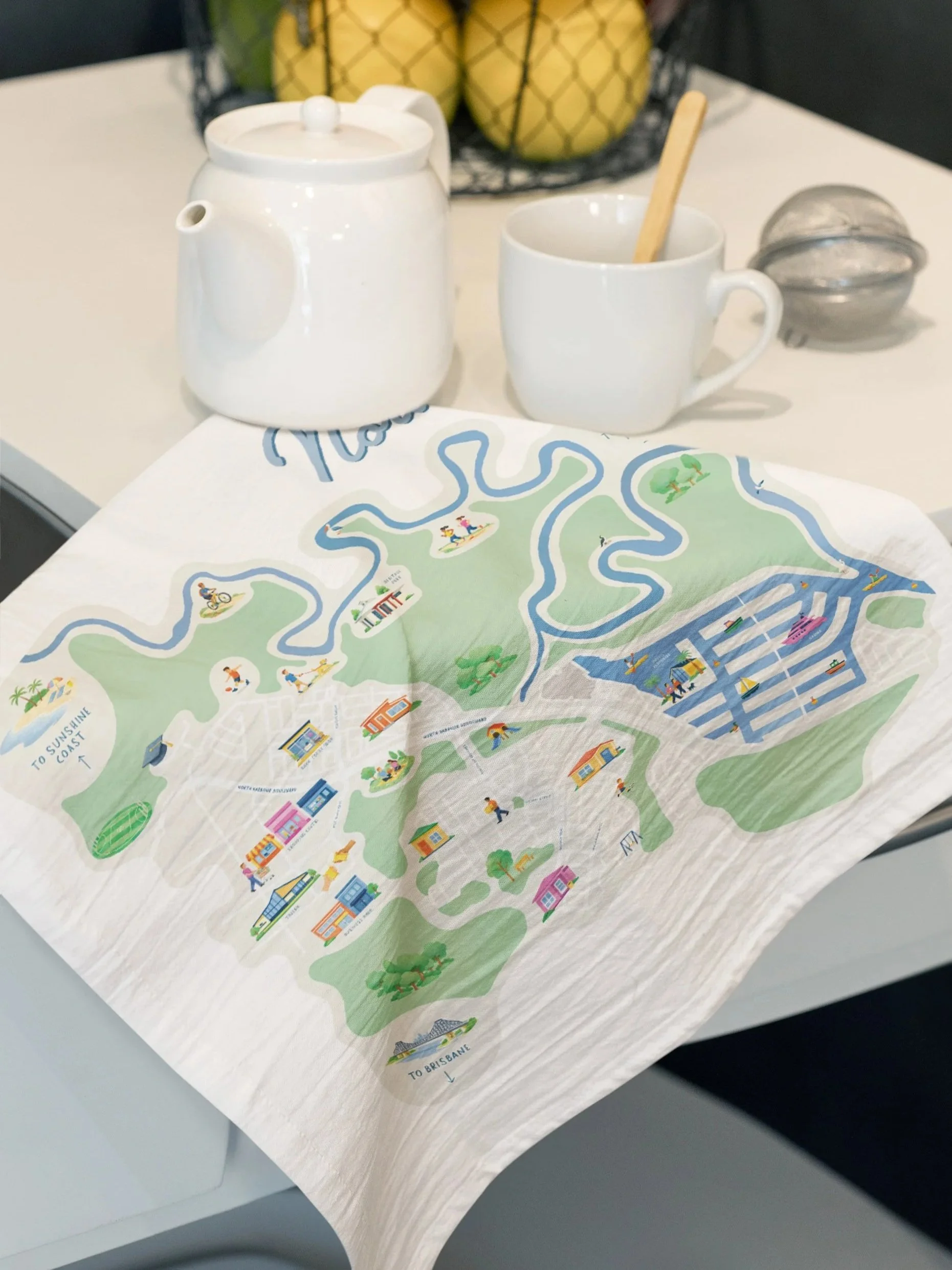
ILLUSTRATED COMMUNITY MAP
A softer, more character-led map style helped make the development feel more tangible, memorable and community-focused.
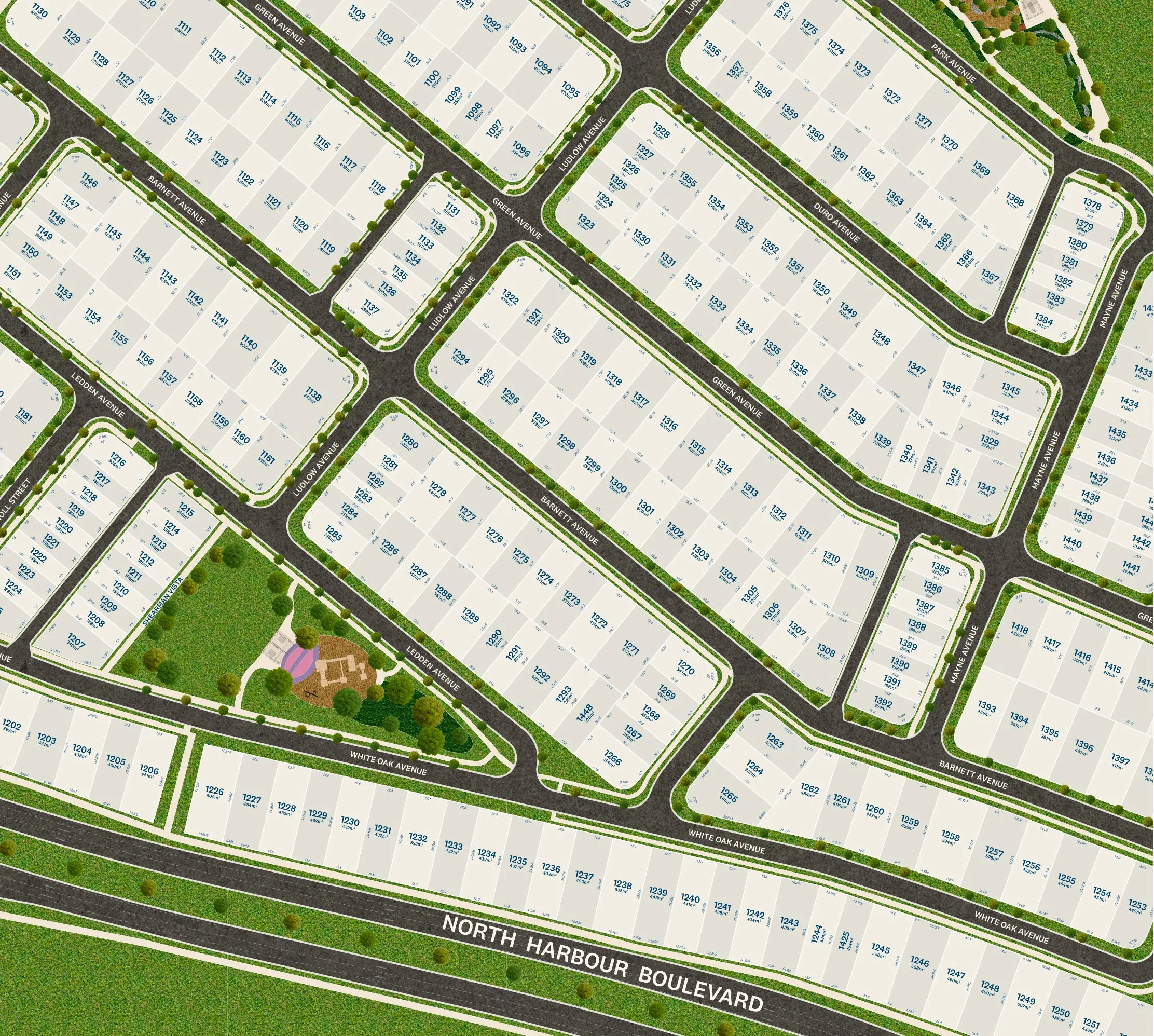
PLANNING MAPS & MASTERPLANS
Alongside the illustrated pieces, more technical planning maps were refined to make complex land, precinct and release information easier to understand.
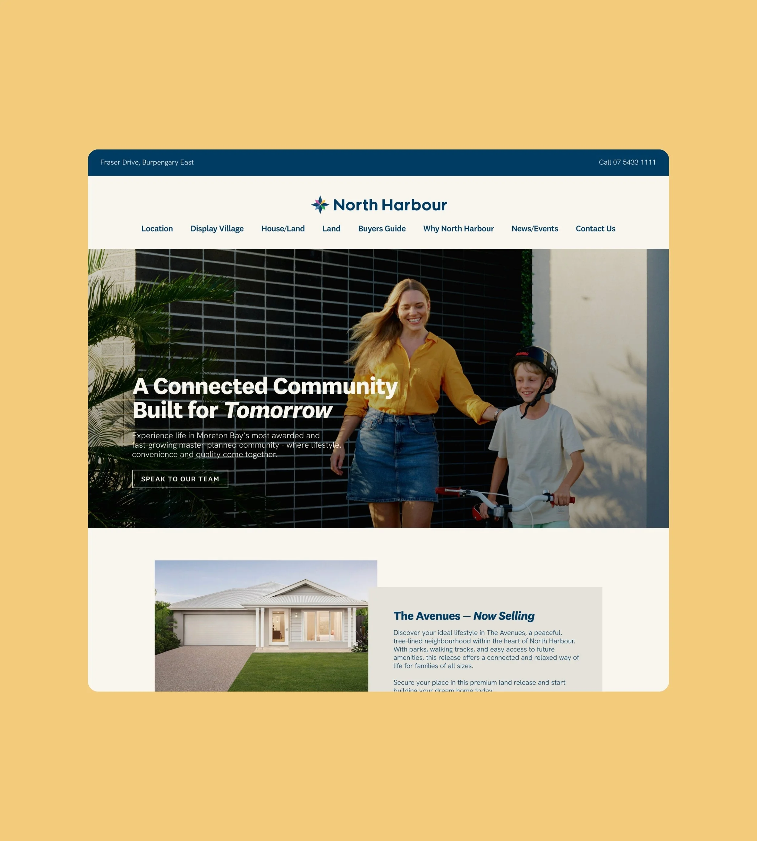
Digital ApplicationsKeeping the system clear across digital touchpoints.
The refreshed identity also needed to translate clearly across North Harbour’s digital presence.
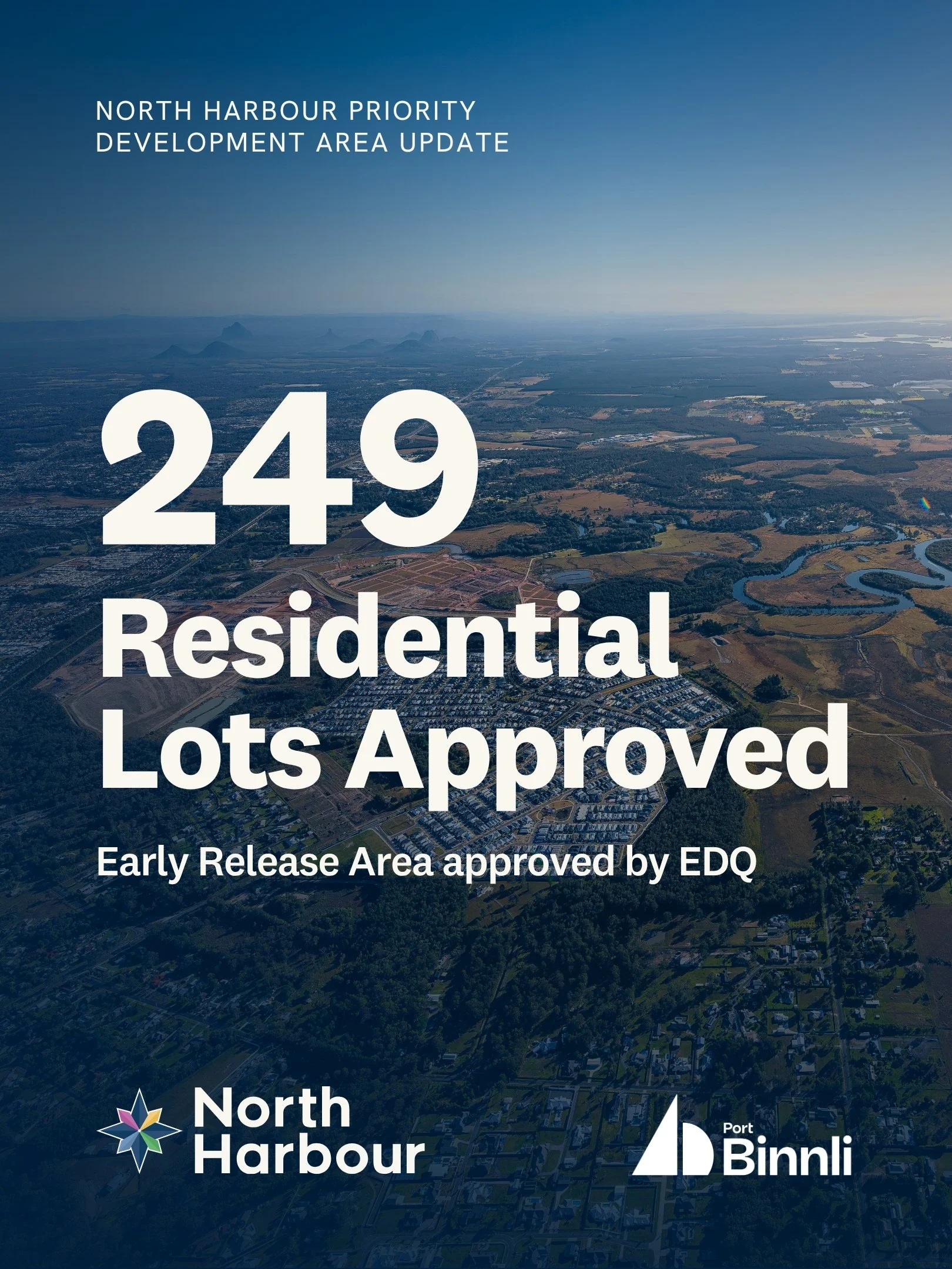
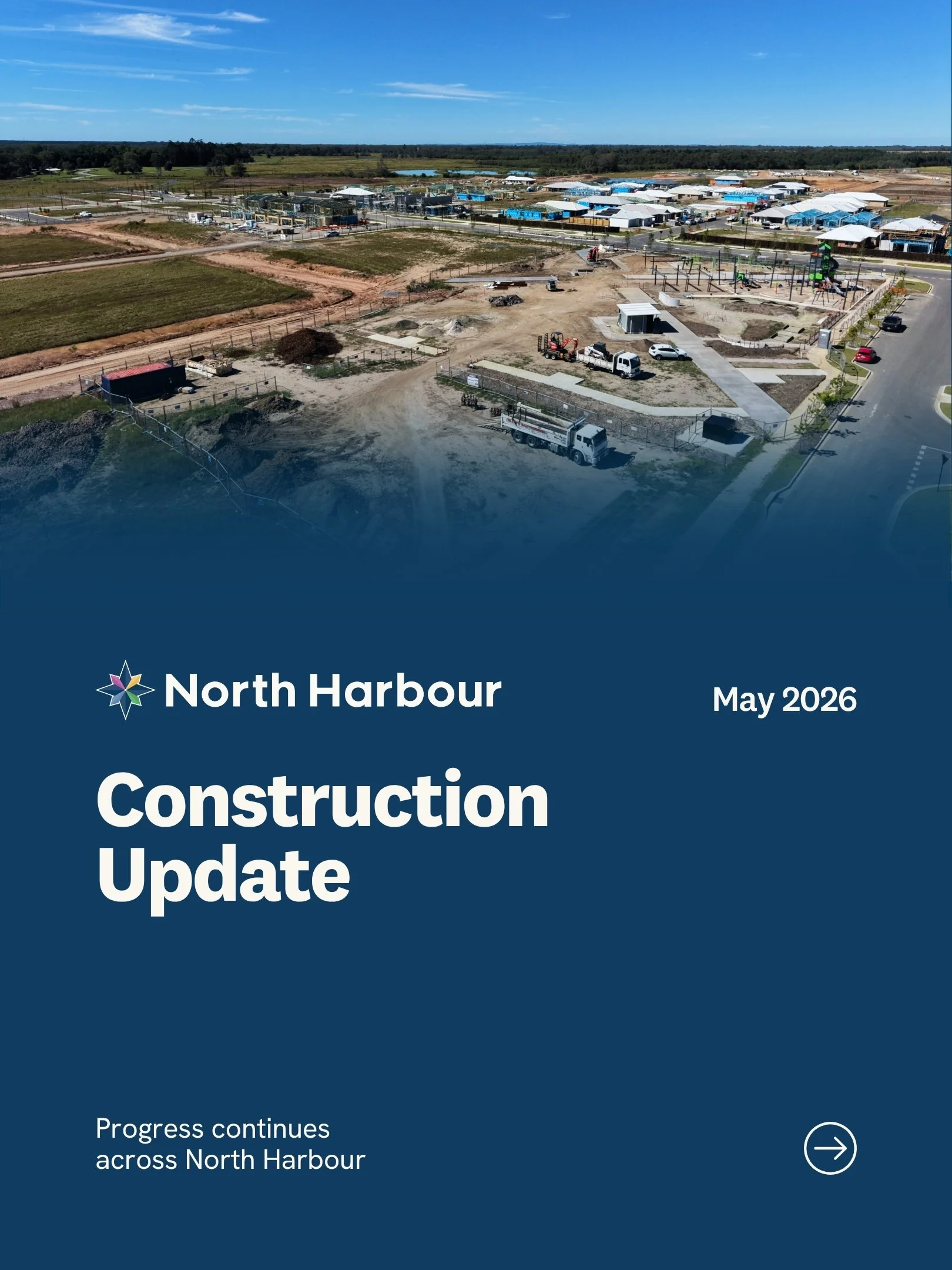
I applied the brand system across website layouts, social media assets, email banners and digital campaign materials, creating a more consistent visual language for both quick-scroll content and more detailed information-led communications.
Each format needed a different level of hierarchy, but the overall experience still had to feel connected, recognisable and easy to navigate.
04 · built to grow
A flexible identity for a community growing in many directions.
North Harbour is not a single product, campaign or audience.
It is a growing destination made up of residential neighbourhoods, commercial precincts, business opportunities, community spaces and future lifestyle-led developments.
The identity system was built with that growth in mind: structured enough to stay consistent, and flexible enough to keep moving with the development.
05 · WHERE IT LANDED
A clearer brand system for the next stage of North Harbour.
The refresh gave North Harbour a clearer foundation for its next stage of growth.
The main identity felt more polished, the sub-brands became more connected, and the wider system gave the team a more consistent way to approach print, signage, digital assets, maps and future brand applications.
It was not about making North Harbour look like something else. It was about making the brand easier to recognise, easier to use and easier to grow together.


PROJECT IMPACT1 REFINED MASTER BRAND
a stronger core identity that kept existing recognition intact
7 CONNECTED SUB-BRANDS
brought into a clearer and more cohesive brand family
1 SCALABLE BRAND SYSTEM
designed to work across print, signage, digital and future rollout
BUILT FOR GROWTH
designed to support North Harbour as the development continues to expand
a note from chloeA refresh built around recognition, structure and room to grow.
North Harbour was a reminder that a brand refresh does not always mean starting from scratch.
The strongest part of this project was working with what already had value: the recognition, the compass, the community vision and the long-term ambition behind the development.
My role was to bring more clarity and structure around that, so the brand could feel more consistent today while still having room to grow tomorrow.
Chloe Overton, Overton Design Studio
More work, more routes
Explore other brand identity, website and creative direction projects from Overton Design Studio.

READY FOR TAKEOFF?
Your brand has sat on the tarmac long enough. If you’re ready to turn your ideas into something that finally feels right, I’d love to hear about it.